Glorious Alpha Two Testers!
Alpha Two Phase III testing has begun! During this phase, our realms will be open every day, and we'll only have downtime for updates and maintenance. We'll keep everyone up-to-date about downtimes in Discord.
If you have Alpha Two, you can download the game launcher here, and we encourage you to join us on our Official Discord Server for the most up to date testing news.
UI Refresh?
 xenith_terrek
Member, Founder, Kickstarter, Alpha Two, Early Alpha Two
xenith_terrek
Member, Founder, Kickstarter, Alpha Two, Early Alpha Two
I know most games have an "alpha/beta" UI they use prior to releasing.
My question for the Devs, is does Ashes plan on doing a cosmetic UI refresh come beta/launch to make it look/feel more modern? I think aesthetically, this would be a huge boost of "freshness" to the game, and a welcoming one.
I feel like the graphic designer for the games UI versus the designer for the media assets we see on streams (ex: the road map graphic design) are two different people w/two different levels of experience.
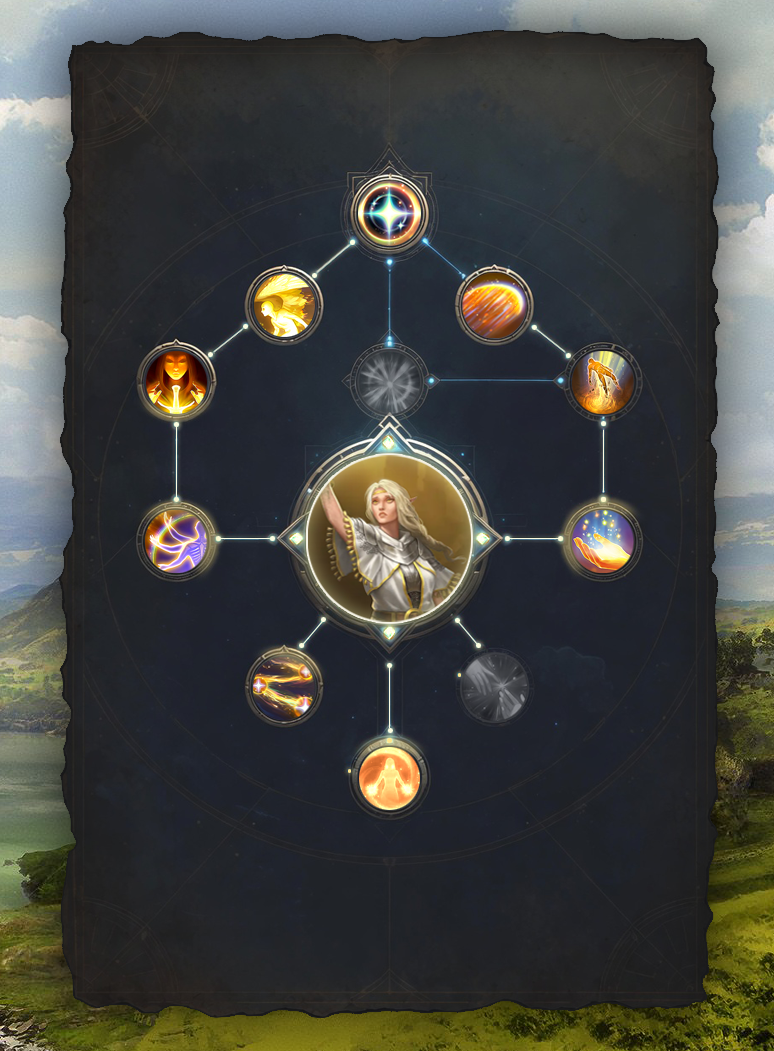
I took a few mins a threw together a UI refresh of the skill tree just to give a visual example of what I mean by modernizing the UI. Add some shimmer effects, etc. and I think you'd have a solid winner.
Yes, it's not a full skill tree and buttons, etc. are missing, but my goal was to just covey aesthetic feel.
What are everyone else's thoughts?
My question for the Devs, is does Ashes plan on doing a cosmetic UI refresh come beta/launch to make it look/feel more modern? I think aesthetically, this would be a huge boost of "freshness" to the game, and a welcoming one.
I feel like the graphic designer for the games UI versus the designer for the media assets we see on streams (ex: the road map graphic design) are two different people w/two different levels of experience.
I took a few mins a threw together a UI refresh of the skill tree just to give a visual example of what I mean by modernizing the UI. Add some shimmer effects, etc. and I think you'd have a solid winner.
Yes, it's not a full skill tree and buttons, etc. are missing, but my goal was to just covey aesthetic feel.
What are everyone else's thoughts?
1
Comments