Glorious Alpha Two Testers!

Phase I of Alpha Two testing will occur on weekends. Each weekend is scheduled to start on Fridays at 10 AM PT and end on Sundays at 10 PM PT. Find out more here.

Check out Alpha Two Announcements here to see the latest Alpha Two news and update notes.

Our quickest Alpha Two updates are in Discord. Testers with Alpha Two access can chat in Alpha Two channels by connecting your Discord and Intrepid accounts here.

[Feedback Request] Looting Updates Shown in January Livestream

VaknarVaknar Member, Staff
edited February 2023 in General Discussion
Hello glorious community,

We’d like your feedback on the Alpha Two Looting Updates shown during the January 2023 Development Update Livestream.

To help guide this conversation, here are a few thought starters:
  • What did you like and what didn't you like about how stats were displayed on equipment?
  • What did you like and what didn't you like about the tooltips when comparing items?
  • Regarding equipment and looting UI, while ours is a work-in-progress, what do you think other games do well?
Please don’t feel limited by the thought starters above. Feel free to share anything you’d like about Ashes of Creation’s Looting shown during the January Development Update

We’ll be compiling a report for the design team on Friday, February 8 2022, so please try to get your feedback into this thread by then!

Everyone here at Intrepid Studios looks forward to reading all the feedback you have to share!

Important Update

Hello all!

I know many of you have already left your feedback after watching the livestream on Friday. I wanted to drop a reminder that the video was re-recorded and posted on YouTube, which you can find here:
https://www.youtube.com/watch?v=DwWK9HJNJRQ
Be sure to check that out, as it may change some of your feedback! ^_^
community_management.gif
«13

Comments

  • LeukaelLeukael Member, Alpha One, Alpha Two, Early Alpha Two
    I would like the ui related to looting to look more similar in theme with the quest log. Same with the tooltips. The quest log was more sleek and color coded where as the loot interface had much more points, rougher edges, and felt like there was a pass done on the log that these others have not experienced. I would like the ui to be consistent in theme.

    For what other games do well in terms of ui, I like the modern ui for party health bars that are color coded via class and being a block that has debuffs color coded based on how you interact with them (like blue debuff is magic debuff removed with a dispel magic class, etc.)

    Overall, I really enjoyed it and am excited to see more - keep up the great work!!
    Stag-Axiom-Sig-LEAUK3.png
  • RiddixRiddix Member, Alpha Two, Early Alpha Two
    one addition that I would like to see in the tooltip is a button to show more options. while yes you did have the bigger box explaining stuff, it feels cumbersome if it pops up every time or if you close it, then you will lose the tooltip guides "forever". so a button to show more options like split and compare would be welcome.

    another question I have is that during the stream, it was mentioned that there could be a possibility of "loot all" button/action, how will it work with the need/greed system?
  • SongcallerSongcaller Member, Alpha One, Alpha Two, Early Alpha Two
    edited January 2023
    I realise you fought elite mobs and more specifically bosses so I'm not sure how 'rare' finished items are in the grand scheme. However, I feel a full set of armour should not be achievable in the same area - it means we can just farm the area 8 times and get 8 players a lot of loot. The loot options were great and I have no issues with them. You could add a DKP System for Guilds though. I'd rather not have to use separate website or tool for DKP when required.

    I do love to get varied colours in drops. Please keep the tiers of gear intact because its nice to move up brackets between the colours when possible.

    The loot window needs a loot all option and the tooltips need to be trimmed. The loot windows could look better and the inventories should be able to be separated into pre-selected item windows so we don't just have a jumble of items. The options of need, greed and pass should be bigger and better placed. Each item should have a window rather than it all being crammed into one window with little buttons.

    We do need some form of auto loot. Don't want to spend time sat down and time looting when the respawns are rapid. Please have a comparison panel where new loot is shown against current equipped gear.
    2a3b8ichz0pd.gif
  • novercalisnovercalis Member, Founder, Kickstarter, Alpha Two, Early Alpha Two
    .
    {UPK} United Player Killer - All your loot belongs to us.
  • George_BlackGeorge_Black Member, Intrepid Pack, Alpha Two
    edited January 2023
    Why was a gear item untradable? It goes against how this mmo is built to work.
    Could a Dev comment in this?

    Also, the common uncommon rare etc etc coloring item frames are a cheap illusion of progression. Everybody with the tiniest of effort will manage to ignore the white green blue items. It's a waste of development time.
    Why bother with that stuff at: Lv1, Lv17, Lv24, Lv35, etc etc?
    Completelly ignorable. Put more focus on crafting/farming gameplay that common uncommon rare frames that everybody will ignore until at least Lv40.

    When I was playing eso and ff14 I completelly ignored the color frame of the dropped items. I only bother to get gold when I reached a decent level.

    Full item drops should be a bit more rare, materials should be a bit more frequent. More info on the gold-hunting certificate system. They seemed rare in todays video.
  • DABZ16DABZ16 Member, Alpha Two
    Im a bit confused on how the looting update effects the crafting, trading and economic systems. In the video steven was shown picking up only finished items and very few crafting materials. Though in the past it was said that only very specific mobs would drop finished items. Then it was shown that one of the items steven tried to trade with another player could not because it binded to him. In the past steven said everything was tradable. If these are changes specifically for the stream, or I was misunderstand what was happening that is fine, but i'd like to understand where I misunderstood. If i did understand correctly then the change greatly effects the structure of the economy making crafting less important with a greater abundance of finished goods to be found in the world.
  • UI iteration is looking really good! The quest journal I think looked the best, and I would echo some others thoughts here that the theme of it should follow suit through all the UI windows. I still find the party frame colors to be too bright, so if there is a way to tone that down or just give us the ability to tweak it on our own that'd be great.

    The only thing I saw in the new UI stuff from January stream that didn't really sit well with me was the actual inventory bag window, it looked like it was a smaller window and had a scroll function to see things lower down in the bag. That is a huge annoyance in games. If I can't open my bag and see everything in it all in once screen, I don't like it. Its much nicer to just have everything all in my eyes.

    I won't praise World of Warcraft for a lot of things these days but, I will say that they do the Bag screen really well. And mostly the character paper doll too though I do wish it was a bit bigger with more info.

    I like having a fully animated character to view in the paper doll screen, one you can move and zoom in on.

    Also there needs to be a visual preview some how before equipping and item. WoW does that really well too.

    What I don't like in other MMO's is when they have things like Gear Score, and a defined Green Arrow Up for what they consider an upgrade, and a Red Arrow Down for a down grade. I like Items and itemization that allows for more meaningful choices to be decided by the player for their own specific needs. Not just because an item has a higher gear score number, or a green arrow told them its better.

    Thanks for the hard work you are all doing! UI is really coming along :)

    Ps. loved the incoming trade request UI in the bottom left when it happened, good stuff!
  • I would also add, and agree some some others here that I think the idea of White, Blue, Green, Yellow, etc etc to show an items quality/rarity needs to evolve. It works great in games like diablo where loot is just exploded from everything all the time. But it doesn't make for compelling loot, especially when you work hard for a drop and end up getting a lower tiered version of it because of RNG.

    Also side bar, not exactly a UI thing more of an itemization thing. I think there should be items out there with secret proficiencies or attributes that only unlock after a very long time of use. Obviously would make most sense for things like tools or end game items.

    Eg, At the end of the base game, lets say I find a max lvl dagger. Lets not call it a legendary weapon, because weapon ranking and rarity is silly, but since its a max lvl item it has the potential to be more in the long run. I use that dagger as my main weapon for like 8-12 months real life time. The item should then augment with my proficiencies or have a logical extra attribute that unlocks depending on how I use it. This could be an RNG thing tied to game logic and recorded achievements. Maybe over the course of 8 months I kill 10,000 undead things with this dagger so it gains a bonus to undead.

    Or maybe thats more of a character augment that could happen over time? Maybe less focus on the item itself but more the character. Since i've killed 10,000 undead with a masterfully crafted dagger I naturally have a higher skill against undead with daggers? Or if I spend a lot of time walking in the snow, I become adapted to it and can move quicker on snowy terrain? Now im just really thinking out loud haha, totally off topic. I stop now.
  • LudulluLudullu Member, Alpha Two
    The stat window should automatically compare what you're wearing to what your mouse is hovering over (if it's the same item type). The stat window itself was pretty basic, but the items themselves were pretty basic, so I don't have any concrete feedback on that front. It was easy to read, so that's always good.

    As for looting UI. It looked serviceable. I'm not used to the "need/greed" system, so don't really have anything else to say on it. As long as we have the option to pick any other looting method - I'll never see that window again.

    I definitely like the mention of the "you can quick-loot anything in a small radius" feature. That will be really useful if we have locations with mob groups or potential trains of mobs.
  • AzheraeAzherae Member, Alpha One, Alpha Two, Early Alpha Two
    DABZ16 wrote: »
    Im a bit confused on how the looting update effects the crafting, trading and economic systems. In the video steven was shown picking up only finished items and very few crafting materials. Though in the past it was said that only very specific mobs would drop finished items. Then it was shown that one of the items steven tried to trade with another player could not because it binded to him. In the past steven said everything was tradable. If these are changes specifically for the stream, or I was misunderstand what was happening that is fine, but i'd like to understand where I misunderstood. If i did understand correctly then the change greatly effects the structure of the economy making crafting less important with a greater abundance of finished goods to be found in the world.

    This please. I already don't like the whole 'hunting certificate' thing, and I 'get' that for testing purposes one might want to let mobs drop loot, but...

    In the end, why build a generic system WRONG/against your later design intention just because things aren't readyish?

    Also 'Item is not Tradeable'. What?

    I don't have a problem with this on principle technically, there's good reasons to sometimes have these, but I definitely thought this game wasn't going to have that.

    Oh and I hated the looting UI before and I hate it now. I didn't really have a good way to articulate the reason, before, and I don't have one now. I've been trying to compare more and more to get past my bias from my simplistic 20-year old game and its 'entire separate window with an item list' since it is definitely almost the same, but I haven't managed yet.

    So I assume I'm hating on the looting UI unfairly right now and will have to try again to give proper feedback later, but as of now... I really hate it.
    ♪ One Gummy Fish, two Gummy Fish, Red Gummy Fish, Blue Gummy Fish
  • RiotusRiotus Member, Alpha Two
    Maybe this was just a setting that they turned off to make the video less cluttered but, as a tank, I really want to see a list of active enemies and their aggro targets, especially in a game with this much fluid movement.
  • AshganAshgan Member, Alpha Two
    DABZ16 wrote: »
    Im a bit confused on how the looting update effects the crafting, trading and economic systems. In the video steven was shown picking up only finished items and very few crafting materials. Though in the past it was said that only very specific mobs would drop finished items. Then it was shown that one of the items steven tried to trade with another player could not because it binded to him. In the past steven said everything was tradable. If these are changes specifically for the stream, or I was misunderstand what was happening that is fine, but i'd like to understand where I misunderstood. If i did understand correctly then the change greatly effects the structure of the economy making crafting less important with a greater abundance of finished goods to be found in the world.

    This is a pretty big concern for me as well... I thought for once we are going to get a proper MMO with proper player interaction and I'm really hoping a lot of things are just for testing but egh I've been dissapointed so many times that I was ready to just give up on the MMO genre and saw AoC, but the more is being shown the more I'm starting to have doubts...
  • LinikerLiniker Member, Alpha One, Alpha Two, Early Alpha Two
    edited January 2023
    One thing I need to talk about, I am really concerned about why Intrepid is using Exclusive Cosmetic Sets as in-game equipment, the Titanbark Set is a cosmetic, I'm not sure why it would drop from a boss and be usable this was not how we were told cosmetics would work, they were supposed to be NPC exclusives and not obtainable ingame, also, we see Steven use a lot of cosmetics recolors, those should also not be usable by players, only NPCs, so I am really confused here, a clarification would really be appreciated

    I'm also confused on equipment being bind when they drop, and so many NPCs dropping equipment pieces, I thought crafting would be the main way of getting gear, this seems really like a theme park, I'd much prefer if Most, if not all drops were parts to use in crafting

    as for the UI, I really, Really enjoyed the UI it's looking neat and modern, love it! from the tooltips to the inventory, quest logs, great job with that! It's finally looking like a "real game"

    img]
    Recrutamento aberto - Nosso Site: Clique aqui
  • AzheraeAzherae Member, Alpha One, Alpha Two, Early Alpha Two
    After watching the 'new' showcase:

    Unfortunately I still can't say much positive, the new looting rule control sounds good, but the UI for controlling changes to it would have been on someone else's screen.

    I'm still working on 'why I hate the UI for drops'. Still pretty sure I'm biased, but I'll ask my UI designer to go through it with me and get back with it if we figure it out.
    ♪ One Gummy Fish, two Gummy Fish, Red Gummy Fish, Blue Gummy Fish
  • Rogue27Rogue27 Member, Alpha Two, Early Alpha Two
    Also, the common uncommon rare etc etc coloring item frames are a cheap illusion of progression. Everybody with the tiniest of effort will manage to ignore the white green blue items. It's a waste of development time.
    Why bother with that stuff at: Lv1, Lv17, Lv24, Lv35, etc etc?
    .

    What an absurd take, is the game meant to be completely devoid of interesting or rare gear until your 90% through leveling? The frame color to me is indicative of rarity and a small power spike for gear at that current level and has nothing to do with greater character progression.
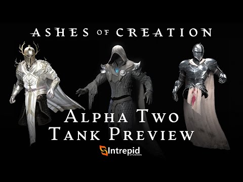
    Also for the set shown in the tank preview that's something id be going back to collect completely if I didn't manage to complete it while leveling.
  • oneuproadoneuproad Member, Braver of Worlds, Alpha One, Alpha Two, Early Alpha Two
    edited January 2023
    I think the quest journal UI is hitting the aesthetic vibe of the game and it is on the right path, same with the map.

    The inventory UI seems simple enough from an outside look. Only thing is... PLEASE have a search bar option, and for journal also.

    The looting UI was basically "done" in my eyes. Maybe some size adjustment and aesthetics, but I don't see what other options it would need. I am happy already there is a "greed all" and "pass all" option. No progression towards carpal tunnel by having to click each loot.

    It was mentioned to add proximity loot all. Yes, please add this(I think this is a feature of GW2?), such a great quality of life. There is nothing more mindwrecking than having to spam same button over such little tasks.

    ---

    Edit: I have one concern about need/greed. If anything and everything can be worn by everyone... then what defines that you are eligible for "need" and someone else not?

    Is it going to be the passive skill tree you choose? Like Staff skill tree, Plate armor skill tree, etc?
  • To the Journal:
    Loved it. It seamed very clear and the color coding was nice. I dont see the need to have a "sort by" option with the other filters in place. With 30 quest you shouldnt loose the overwiev.
    In the window for the quest information i would put the amount of xp you can gain above or below the gold. There is still lot of space for it. I god first little confused if you realy get 225 Gold but then saw that it was xp.

    Backpack_
    A little so slim for me. Would be great if you could change it in size incase you want to have a fast overview about all of the stuff inside.

    Lootwindow_
    Definitly needs a button to gather directly everything inside a loot container at ones. Else it was fine.

    Skill Tooltip:
    To much Text. Yes text is needed...but a more simplified look about what you gain or loose when you activate i would appriciate

    Additions:
    Im not a fan of need, greed, pass. This is only working when equipment is characterbound...and even then, like it happend in the stream, someone is brain afk, role for it and gets it. This can be fixes maybe with a small timer on the items...when this timer runs out you cant trade the item anymore.
    With no soulbound items i see it in games that just everyone is greeding. Especialy rare+ equipment. People just see money in it. More a fan of games that provide loot for everyone. For example in world bosses a chest that everyone gets and then you have the possibility to get something good out of it. Thats more fair and less frustrating.
  • SengardenSengarden Member, Alpha Two
    edited January 2023
    Overall, the UI is looking a lot better.

    To be honest, the stat display on items looks cheap. The font looks like a generic text document and the sizing is too large. It should match the font and sizing of the item frame, or even be a bit smaller

    The actual item frame above the stats that activates on mouse-over looks good.

    Item illustrations look alright, but the empty spaces in the frame are unnecessary. A slight bit of bleed over the edge of the icon frame is okay. Try not to get stuck on thinking you need to show every dimension of each item to scale within a tiny icon image with a pure black background. It’s not an anatomical study, it’s a fun illustration that gives just enough info for us to know it’s a pair of boots, a helm, etc, and whatever bits of trim / color / design that come through in the icon will give us a hint as to the theme or quality of the item. Showing those details will be easier in a tiny icon if you zoom in a bit. WoW does this very well, I think.

    I don’t know what Steven was going on about during the QA when he was resistant to the idea of an auto-loot option toggleable in the options. I don’t want to have to shift-click, double-click, or any of that nonsense just to autoloot. Just let me change it in the settings and auto-loot in one click. Area loot as well, to a certain radius.

    Having to vote on loot changes is good.

    Thanks!
  • Vaknar wrote: »
    What did you like and what didn't you like about how stats were displayed on equipment?
    I liked that it was simple.
    I dislike that it was too simple.

    I'm all for straight forward stats rather than "what does this mean?" But I also think things should have 2-3 stats minimum. Not for the sake of it, but to me it's easy to come up with that much information.
    What did you like and what didn't you like about the tooltips when comparing items?
    Seemed fine. Doesn't need to be any more than it is, imo.
    Regarding equipment and looting UI, while ours is a work-in-progress, what do you think other games do well?
    While I think AoC's is fine, one thing I don't recall seeing was an interaction between your character sheet and comparing while looting was ongoing. Having all that information quickly available on your screen is important for me.
    Please don’t feel limited by the thought starters above. Feel free to share anything you’d like about Ashes of Creation’s Looting shown during the January Development Update

    We’ll be compiling a report for the design team on Friday, February 8 2022, so please try to get your feedback into this thread by then!

    Everyone here at Intrepid Studios looks forward to reading all the feedback you have to share!

    Having loot show up for rolling after the mob is clicked on rather than the item being click may be something to look into?

    Other than that I'm going to keep this post short.
  • belephyabelephya Member, Alpha Two
    The biggest surprise an something that really annoys me, was bound items. If AOC is going to have a truly great player driven economy, it has to have to things continuous demand for item's and the ability to trade.
    Bound items, just drive boring repetitive grind.
  • SpifSpif Member, Alpha Two
    What did you like and what didn't you like about how stats were displayed on equipment?
    The stats displayed were ok, but the bullet point before the ?random? stats are out of place and I'd prefer to see some give and take on the stats. For example, the Hammer could show +12 Physical damage in bold, +2 strength in green, -1 dex in red and +6 physical pen in green.

    I like that the item preview is compact

    What did you like and what didn't you like about the tooltips when comparing items?
    I'm assuming minimum level to use an item is going to be a thing. If so, I'd like to see that number even if I already meet the requirements. It's helps me to decide need/greed/pass. Hiding the item level does not help us.

    When mousing over an item, I'd like to see what I have equipped in that slot alongside the item I'm mousing over. Maybe make that a configurable option. Looking ahead, maybe also have an option to show what it would give if salvaged (assuming the player has the skill to do so) or sold to vendor.

    Other
    Some forgiveness in bind would be great. Allowing a short time window to trade an item in-party would be nice, although it does open up the "need-item-to-sell-it" can of worms.

    Assuming gear drops are going to be as frequent as in the video (I think they should be since this is 8-man content), then streamlining the process of picking up and divvying out gear is important. Wide area loot as soon as any drop is touched. Setup rolls on gear all at once, even if it means a player will get 3 questions on loot roll at once. Being able to pre-select greed or pass at various gear levels at a personal level (IE, I could set myself up to automatically pass greys, greed materials and greed greens) is a good option alongside party loot rules. Party loot rules sould override personal loot rules.
  • FireplayFireplay Member, Alpha Two
    There are 2 things that I am a fan of.
    1. Auto sorting loot
    2. Having a separate screen that shows your character and the items that they are wearing. This screen also shows you all of their stats
    kr9ltkpbhsee.png
  • SirChancelotSirChancelot Member, Alpha Two, Early Alpha Two
    I hope there is some sort of AOE auto loot... Because having to click on everything is kind of a drag.
  • WarfinWarfin Member, Leader of Men, Kickstarter, Alpha One, Alpha Two, Early Alpha Two

    I was watching the tank preview. Would it be possible to add your targets target window ? so I know I can see what I will be targeting but can you add a window so I can see what the mob is targeting ? this will help substantially with threat control. Also will it be possible to customize the UI to change the position of windows like the group window etc etc
  • KrastyKrasty Member, Braver of Worlds, Kickstarter, Alpha One, Alpha Two, Early Alpha Two
    Vaknar wrote: »

    *What did you like and what didn't you like about how stats were displayed on equipment?

    * What did you like and what didn't you like about the tooltips when comparing items?

    * Regarding equipment and looting UI, while ours is a work-in-progress, what do you think other games do well?

    Please don’t feel limited by the thought starters above. Feel free to share anything you’d like about Ashes of Creation’s Looting shown during the January Development Update


    1.) Regarding equipment and looting UI, while ours is a work-in-progress, what do you think other games do well?

    : for me, I would 100% remove the timer and put all undecided loot aside, or at least it should be set in the loot options so that there is a possibility that there will be loot without a timer.

    and mass loot like wow is probably the best option if you don't want auto-loot or niche loot like l2 where loot was all falling on the ground and you could pick it up one by one:
    abyoae3lf2sr.png

  • ElegenElegen Member, Alpha Two, Early Alpha Two
    edited January 2023
    So I know this is mainly meant for feedback on the loot UI, so that feedback is first. But I wanted to also give feedback on other parts of the UI.

    Inventory/tooltip: Inventory looks good overall. On the tooltip hover over, I'd love for it to say in parenthesis after the stats if its + or - your currently equipped item in that slot. Like if your current headpiece has 20 armor and 5 intellect and the new one in your inventory has 16 armor and 8 intellect then the tooltip is 16 armor(-4), 8 intellect (+3). I know not everyone may want this so maybe make this a toggle able option.

    Item comparing tooltips: Looks fine from what was shown (compared shield with no stats vs one with stats). Though I’d like to see what I mentioned above about being about being able to see at a glance in this compare the +/- of each stat to current gear.

    Equipment/looting: Group loot window looks fine. Show in chat log who picks what option (need/greed). Chat log should show who loots what items and from what. Quick animation in bottom right when receiving loot is good, but need to combo that with a loot chat log. When hovering over items in the loot window, it should show the tooltip regardless of if hovering over icon or name (currently its only icon).

    Map: Icons look good. Not sure if it’s part of it, but if you hover over the icon it should show additional information (name, what this icon represents, etc.). I like more detail in my maps and this just doesn’t do it for me. It feels way too zoomed out and not enough detail. Add zooming if it’s not a thing. Add an icon key. I’m also meh on the painted art aesthetics for the map. I think it feels too blurry to me? Hard to explain.

    Nameplates (above enemies): Please add HP in some form (numbers/bar/both/something else). I don’t even care if it’s off by default, as long as it’s an option you can turn on. If you can see an enemy’s health by clicking on the mob, there’s no reason to not show on the nameplates above them. As silly as it sounds, this is one of my biggest grips with the game so far. Having to alt tab until you find the low health mob the rest of the party is targeting is not fun. Please change the default colors for friendlies vs hostile. And in general allow us to customize nameplates for both friendlies/hostile/npc/etc (size/shape/color/location). The ability to mark targets would be amazing as well (think wow skull/x/square/etc).

    Target frame (top center of screen after you click on a mob): Allow us to customize this (size/shape/color/location/etc).

    Player frame: I’m not a huge fan of buffs/debuffs being under the player name in top left. Like I don’t mind it being there, but only if you can also have another separate buff/debuff section that you can customize (size/shape) and move. Particularly when it’s a class mechanic of building up resources. In this case the tank stacks from taking dmg that is spent on grit. That should be a lot more obvious of how many stacks you are at. Like part of the UI down by the abilities should represent this.

    Party: I’d like to see a portrait of the player (3d or not) instead of the class icon.

    Quest log/tracker: Looks good from what was shown.

    Mana for all classes: I know this isn’t UI related, but wanted to give some feedback on it as well. I’m not sold on the idea of mana for all classes. To me that gets rid of class identity and that’s a really important thing. Having classes feel different (even if they all boil down to some form of build resource spend resource) it is important to at least give the illusion the class mechanics are different. Maybe in practice mana for all will feel fine, but on paper, I don’t like it at all.

    Active blocking: I'm not a fan of it for non tanking roles, but if it stays that's fine.
  • 1. What did you like and what didn't you like about how stats were displayed on equipment?

    Kind of basic kind of soulless.

    WoW Classic did a good job and I don't think you need to re-invent the wheel, just copy it from there.

    3. What did you like and what didn't you like about the tooltips when comparing items?

    The item ''images'' (icons) were too small and kind of soulless.

    4. Regarding equipment and looting UI, while ours is a work-in-progress, what do you think other games do well?

    World of Warcraft Classic.
  • EmberstoneEmberstone Member, Alpha One, Alpha Two, Early Alpha Two
    edited January 2023
    Q) What did you like and what didn't you like about how stats were displayed on equipment?
    A) I liked how clean it was. Simple to read that you're getting armor, and im smaller text under to indicate bonus stats what you're getting on top of it. I hope that when the item pops up in the party loot window it can also be hovered over and compared.
    Perhaps add what type of armor it is (heavy/medium/light)

    Q) What did you like and what didn't you like about the tooltips when comparing items?
    A) Make it obvious that when holding the compare button you indicate that which item is equipped and which isn't.
    ftcm67938qg3.gif
  • RuerikRuerik Member, Alpha One, Alpha Two, Early Alpha Two
    I am not sure how I feel right now about completed gear pieces being loot. All the time up until now only materials were dropping, and gear needed to be crafted. I was looking forward to how this would make the game economy the center of everything, with gear dropping as loot that changes now.
    ptZBAr9.png
  • DagnarDagnar Member, Alpha Two
    The UI seemed intuitive and user-friendly from what I could tell. Stats on the gear didn't seem to be bloated and it was easy to discern the information you needed from it. The loot-rules change vote confirmation was definitely the best part about the looting UI.


    p0phk9ysukz7.png
Sign In or Register to comment.