Greetings, glorious testers!
Check out Alpha Two Announcements here to see the latest news on Alpha Two.
Check out general Announcements here to see the latest news on Ashes of Creation & Intrepid Studios.
To get the quickest updates regarding Alpha Two, connect your Discord and Intrepid accounts here.
Check out Alpha Two Announcements here to see the latest news on Alpha Two.
Check out general Announcements here to see the latest news on Ashes of Creation & Intrepid Studios.
To get the quickest updates regarding Alpha Two, connect your Discord and Intrepid accounts here.
Dev Tracker & Discord Bot
Takyn
Member, Phoenix Initiative, Hero of the People, Kickstarter, Alpha One, Alpha Two, Early Alpha Two
I just launched a dev tracker for the forums, twitter and reddit:
https://ashesfans.com/devtracker
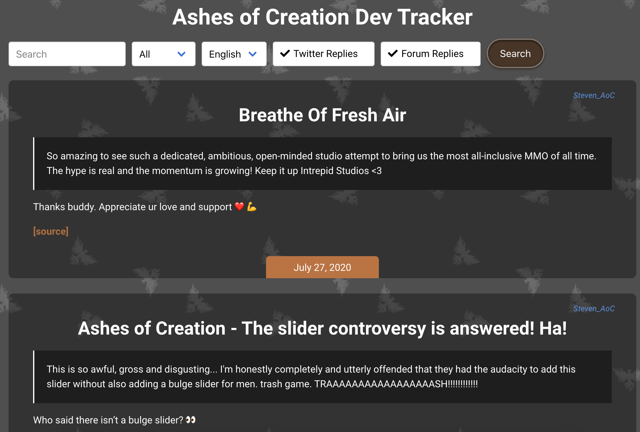
You can filter out replies or search for specific keywords. I've tried to import as much historical data as possible from all sources.
Please let me know if I'm missing any devs or if you'd like to see any other sources added, just ping me here or on Discord: Takyn#0001
The site itself will still get a facelift when I find some more time, and I might change the layout of the dev tracker to make things easier to see at a glance.
Edit: You can now also get the discord bot that will announce any new dev posts directly on your server!
3
Comments
The only two thing I'd suggest you to revise:
Currently, the images are too bright and it clashes with the legibility and it might irritate the eyes of some people. On a side note, you can't really use product logos as graphical elements unless you have the permission to do so. See Picture 1.
I'd advise you to use a left-side alignment for the card titles instead of the center one. The reader's eyes will have less places to jump around. I'd also suggest moving the date and the author to the bottom of the card. See Picture 2.
Picture 1. Default vs Suggested
Picture 2. Suggested alignment
Thanks a lot for the feedback, super helpful!
The background image is actually a placeholder while I'm getting a proper design done (hopefully by next weekend). I tried to get things online and in front of people as soon as it was working.
Good point on the text alignment, I'll try to fix some of it soon.
Ashes Discord Bot
I also implemented at least a few of your suggestions I'll get to the filters eventually, too.
Yeah, I saw that! Awesome Keep us updated