Greetings, glorious testers!
Check out Alpha Two Announcements here to see the latest news on Alpha Two.
Check out general Announcements here to see the latest news on Ashes of Creation & Intrepid Studios.
To get the quickest updates regarding Alpha Two, connect your Discord and Intrepid accounts here.
Check out Alpha Two Announcements here to see the latest news on Alpha Two.
Check out general Announcements here to see the latest news on Ashes of Creation & Intrepid Studios.
To get the quickest updates regarding Alpha Two, connect your Discord and Intrepid accounts here.
Not wanting to knock the effort and beautiful work on the skill animations but....
Valic
Member
I do love the particle effects and the concepts for the skills immensely.... However, the singular colors for some of the classes looks a little... stale? Mainly pointing at the cleric skill showcase that was made a bit ago. I love the concepts and animations from the character but..... "everything" they do is that same gold light? The spear, the whip, the healing..... Idk, couldn't it have a little blue, maybe greens or other colors to make the gold stand out a little better than just nothing but gold/yellow?
I noticed this with the showcase in how autos are done from the tank too and it was a lot of gold particles mostly. I don't object to job theming per say, but I'm going to present some examples where there were themes using a base color but still managed to make it look creative through using effects/coloration.
First here is the "Crusader" class from dfo, a class based around the healing and godly-like healing concept. Buffs, crosses, judgement, light, the whole godly concept. Its main color is of course, yellow. However it manages to do blue with lightning bolts, black shadows and inverts to emphasize the yellow, oranges/reds. Heck, it even manages to have green/purple in 1-2 skills.
https://www.youtube.com/watch?v=RZ4Qa4mePrA
The other example is more blatant and 3d, being Skyforge's Slayer. It's a LOT of purple, don't get me wrong.... but it doesn't just overdose on it alone and rely on the same look for everything. Black chains and nice whites, smoke instead of just solid colors, sharp shapes and etc to define the ninja-esque idea. It plays with indigo a bit in there too but it manages to make the skills have unique textures and definition to make each skill feel different, despite being the same color choice for most of it.
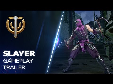
https://www.youtube.com/watch?v=jZsGTm2p1j8
Last example some may be familiar with and I provided a time stamp specifically for the job I'm referring to. Dark knight from FFXIV, definition of edgey, using a LOT of black/red combinations in its whole skillset. Yet, it still uses blues, purples, and whites with also very unique shapes/textures to give those blacks/reds more definition.
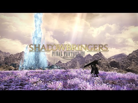
https://youtu.be/jaGxC7wnBDo?t=798
I know this game is going to be in Alpha and things are still a long stretch away. Maybe animations are cut down a bit for now just to serve as placeholders until it's all truly done... But how the video presented the cleric class made it seem as though this was a.... finished product? Even just for the first 10 levels of it only being shown, I feel as though it's just a bit too bland looking with using the same colors for most of the skills(if not all of them). Again, I'm probably just making a large assumption very early on in this game's development, but I can't help but feel a little concerned about the future development if this is indeed the plan for the aesthetics of some classes.
Future mercenary guild owner in Ashes of Creation
“The true soldier fights not because he hates what is in front of him, but because he loves what is behind him.”
― G.K. Chesterton
“The true soldier fights not because he hates what is in front of him, but because he loves what is behind him.”
― G.K. Chesterton
0
Comments
I felt like that was the only interesting animation they had really.
“The true soldier fights not because he hates what is in front of him, but because he loves what is behind him.”
― G.K. Chesterton
Will you say that if they reduce the amount of undead minions you can summon?
Yes if it means the game is more optimized and less laggy lol.
“The true soldier fights not because he hates what is in front of him, but because he loves what is behind him.”
― G.K. Chesterton