Greetings, glorious testers!
Check out Alpha Two Announcements here to see the latest news on Alpha Two.
Check out general Announcements here to see the latest news on Ashes of Creation & Intrepid Studios.
To get the quickest updates regarding Alpha Two, connect your Discord and Intrepid accounts here.
Check out Alpha Two Announcements here to see the latest news on Alpha Two.
Check out general Announcements here to see the latest news on Ashes of Creation & Intrepid Studios.
To get the quickest updates regarding Alpha Two, connect your Discord and Intrepid accounts here.
To chat bubble or to not chat bubble ?
Gubiak
Member
Local communication is a small yet vital part in mmo's. It conveys immediate information and messages from other players standing near you and allows you to react most of the time without looking into a chatbox letting you be immersed in the game while interacting with other players. In different MMO's and MMORPG's one can notice different ways in which local communication is portrayed:
In World Of Warcraft a dark, semi-transparent bubble with bright text does the job and is mostly easy to read in a crowd.
In oldschool Runescape variously coloured text appears above players potentially making it less coherent but does not cover a lot of the screen with bubble background.
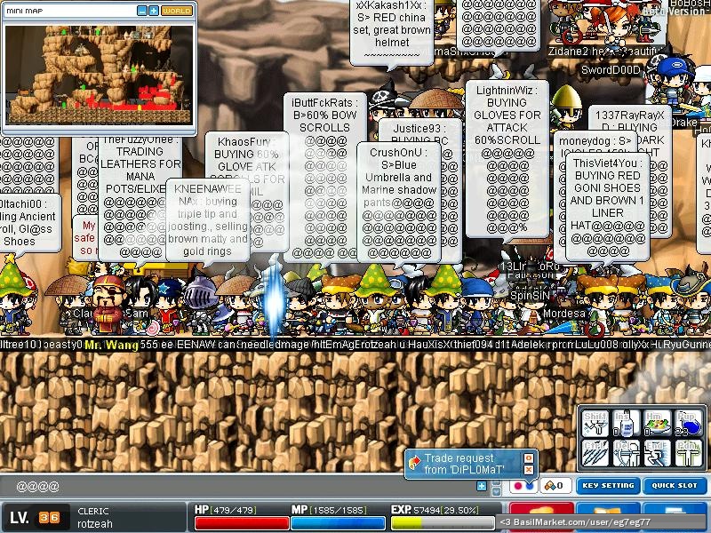
In Maplestory white bubble background with dark text may cause to completely cover up a screen but you probably won't miss a message.
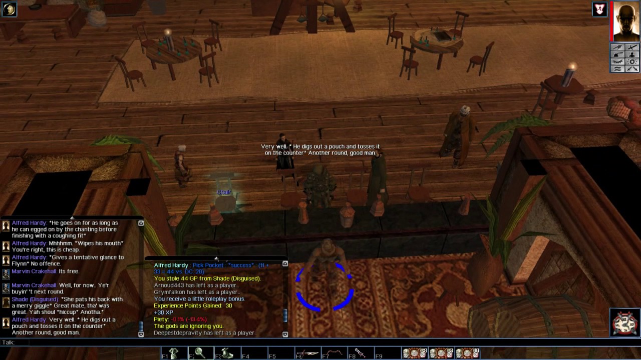
In Neverwinter Nights white text with slightly dark outline appears above characters for a brief moment, making it more immersive and does not obscure screen with background.
What type is your favourite ? Which one would you like to see in AoC ? Are there any that you think would work better ?
1
Comments
I mean, why not?
Potentially giving player this much freedom leaves this system up for abuse. People making their backgrounds non-transparent, lasting forever in neon-bright colours just to advertise their RTM practices for example is not very immersive I would imagine.
You don't determine these things for me, I do.
Oh, I misunderstood. I thought you meant that people will have option to choose display type for other people. In that way I suppose you are right, this could work.
Or at least have it toggleable.
I sure don't want that crap on my screen.
If I had more time, I would write a shorter post.
this
Areas just feel *DEAD* when all there is are chat-log boxes, like in SWTOR. At least with chat bubbles, you get the feeling of activity and life in an area - even if it does result in bots.
Aren't we all sinners?
Not white. Some type of opacity setting.
i mean for people who are annoyed by it, it should be possible to just.. turn off the chatbubbles? thats not hard to do.
that's a hot topic....some people like it, some people hate it with burning passion. The official response is something in the lines of, we might have local voice chat in certain areas like taverns, but nothing is set in stone yet
As for me Id have them shut off. Ive always had an aversion to cluttered screens and UI's because I think it really detracts from the beauty of the environment. Games in general these days are absolutely stunning visually, so its not something Id want to clutter up. Everyone has a preference and I would assume this should be simple enough to satisfy almost everyone.
https://i.imgur.com/Ubof3tx_d.webp?maxwidth=640&shape=thumb&fidelity=medium