I tried to visualize what I mean.
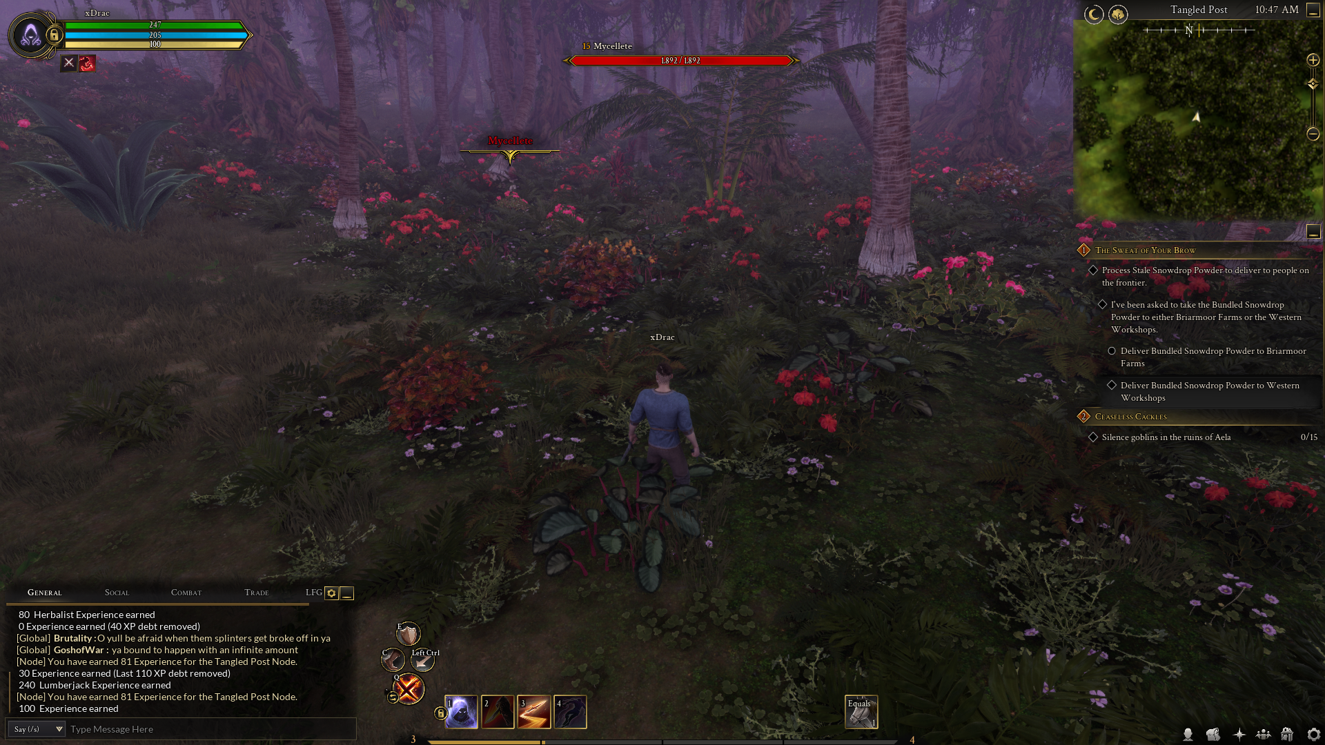
This is the original image, the UI as is currently.
These are my proposed improvements at a glance.
Here I circled areas of improvement for me to better explain and point out what I mean, or why it is done this way.
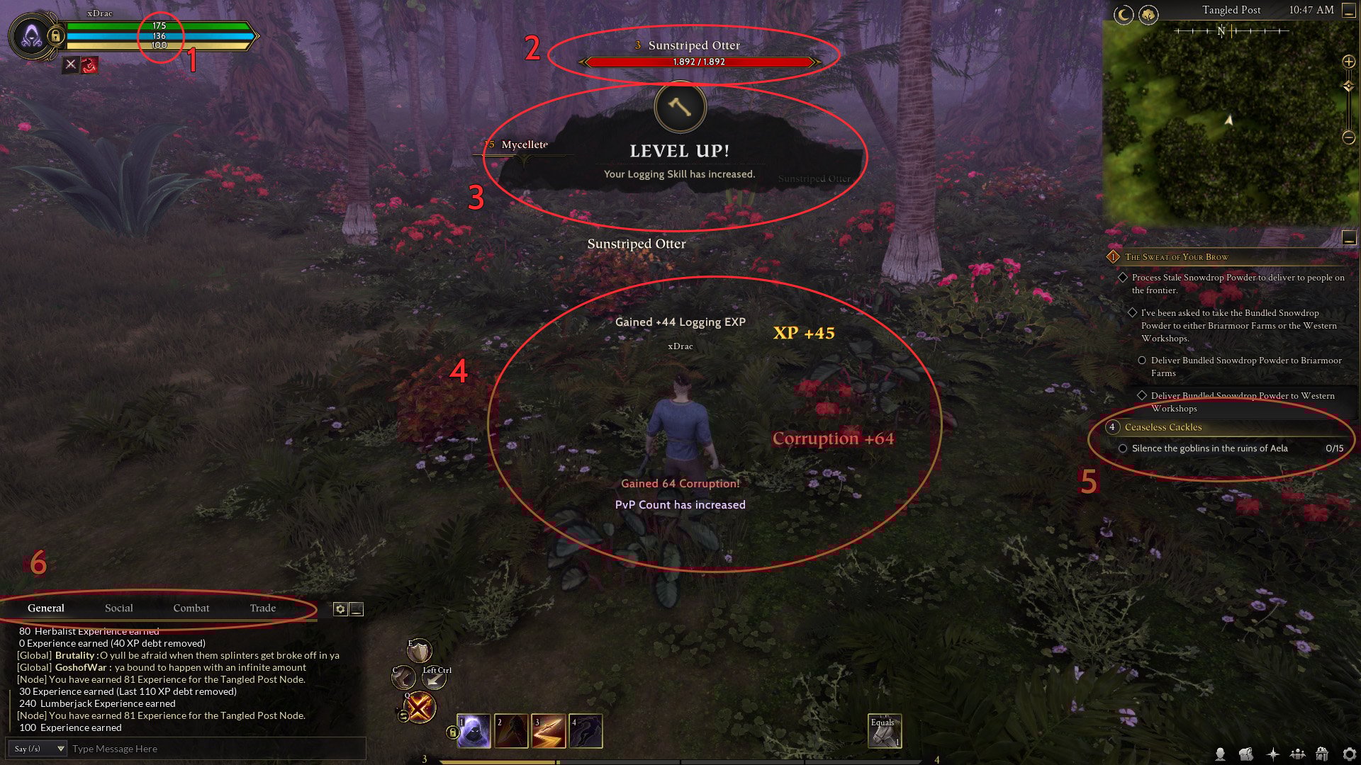
I'll refer to the numbers in the circled image.
1: Replace serif font with sans serif. Font weight is also higher. The serif font is difficult to read when scaled this small and starts to break away in my opinion. Sans serif makes smaller numbers (and text) as is here more readable - to me anyway. It is clearer.
2: Nameplates, perhaps personal preference but I feel the name text is too small when compared in size to the big health bar underneath. Additionally, as with the player bar numbers, numbers on the health bar of the target were changed from serif to sans serif and font-weight was increased.
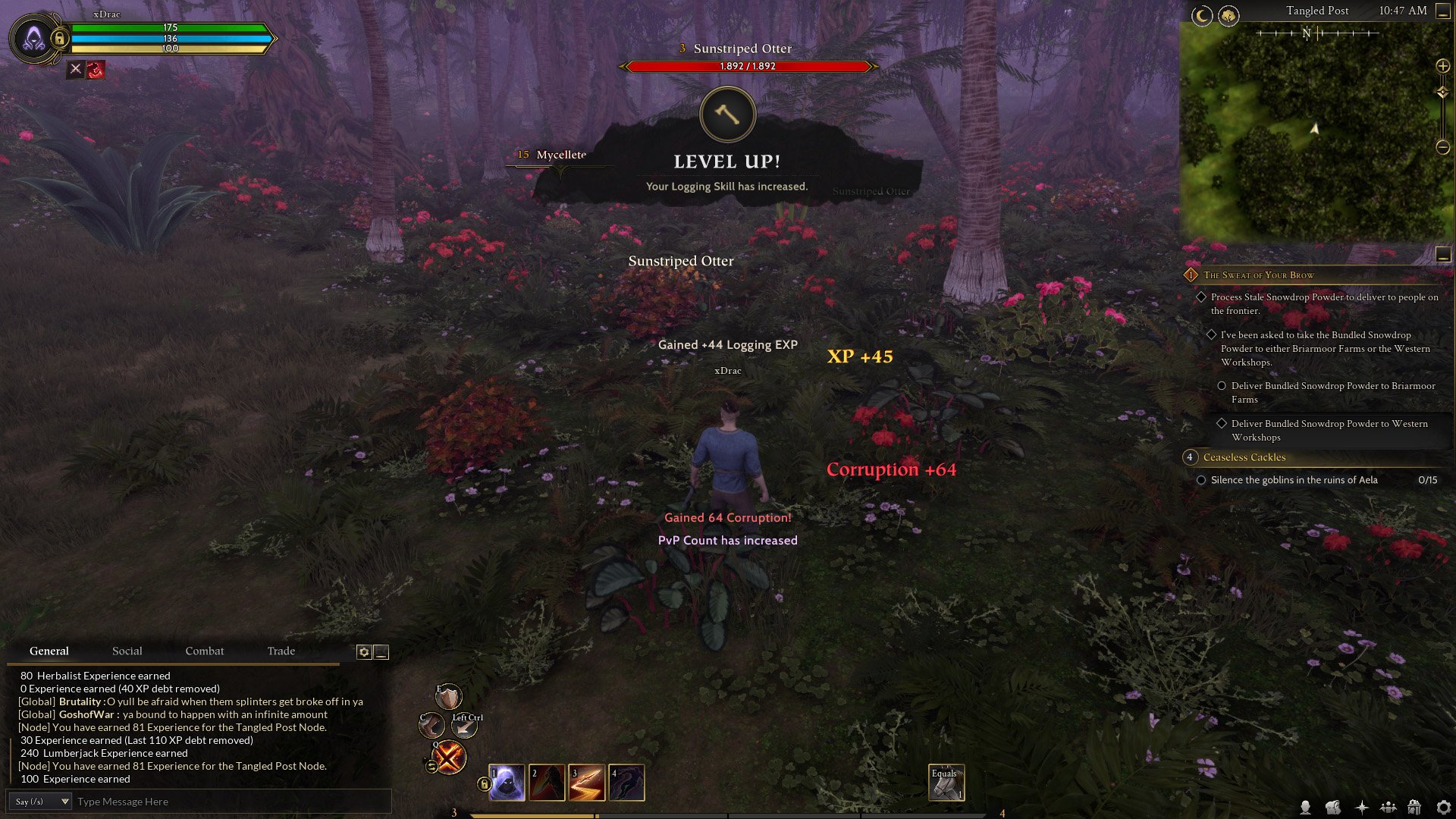
3: Add more general UI Feedback for systems in general. Such as Level ups, numbers going up when interacting, gathering, pvping etc. It shows the player that something happened and is visual feedback to the action they just did. Example here is a level up pop-up for increasing your logging level.
4: As with the level pop-up, add more visual ui feedback for actions, like pvp, exp gain, even for things like killing someone who is purple, or gaining corruption. Few examples of onscreen numbers for EXP etc. Yes, I am aware those partially already exist and can be adjust/changed to preference.
5: It's a general thing, but I would favour getting rid of using small caps anywhere, because when text gets smaller it makes it a lot harder to read. Small sub text of quests was changed from serif to sans serif for hierarchy and readability purposes. Adds context of title=serif and sub=sansserif
6: Much as quest text, replacing small caps text for better readability (example).
Iconography: I noticed in areas such as the quest log etc iconography is sometimes square, when other things like player class icon container next to health bars or party icons etc are kept to circles. I would streamline it (which is why icon on the level up popup is also circled, not squared)
Overall Readability: Please remove small caps


