Glorious Alpha Two Testers!
Alpha Two Phase III testing has begun! During this phase, our realms will be open every day, and we'll only have downtime for updates and maintenance. We'll keep everyone up-to-date about downtimes in Discord.
If you have Alpha Two, you can download the game launcher here, and we encourage you to join us on our Official Discord Server for the most up to date testing news.
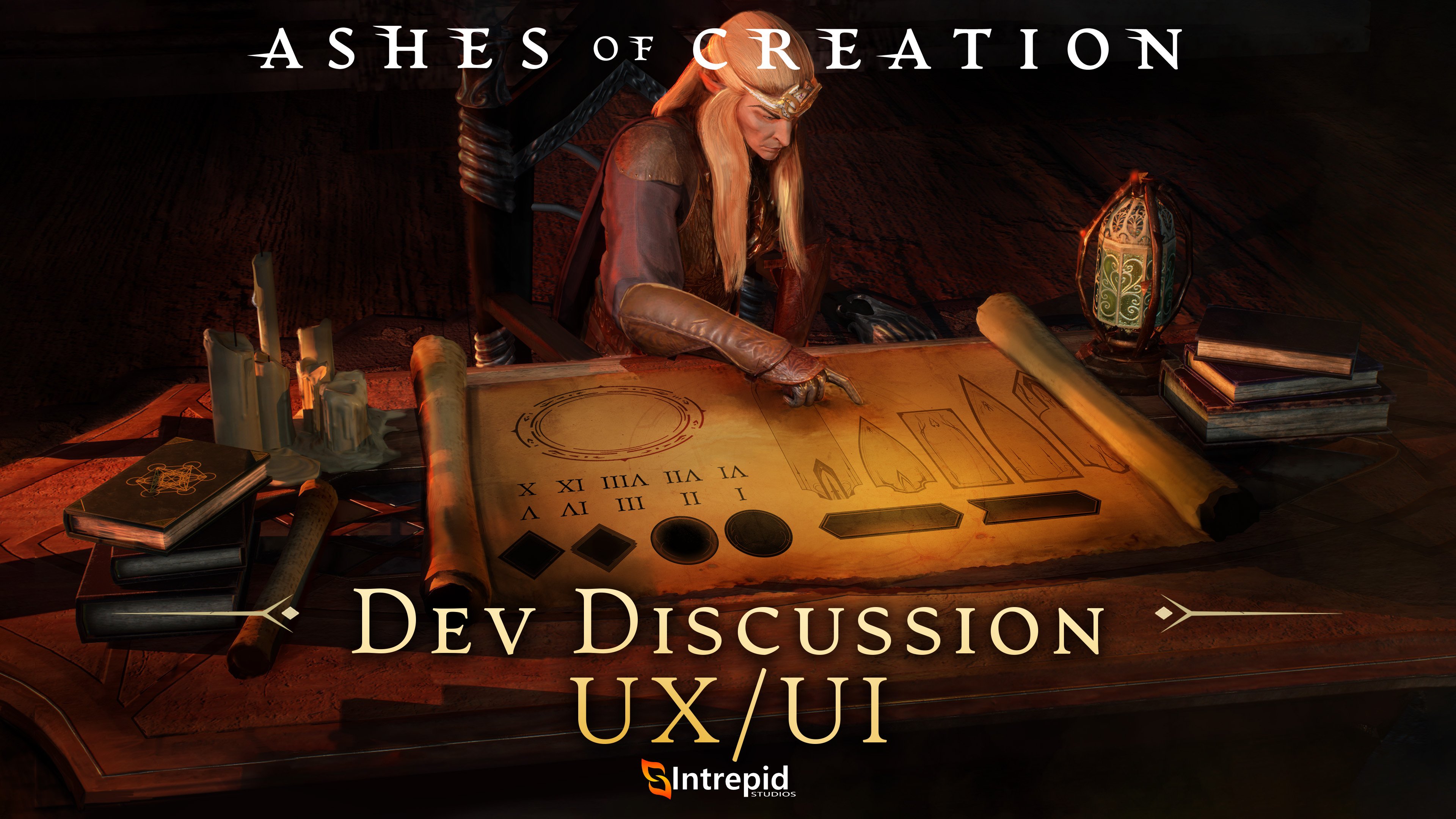
📝 Dev Discussion - Alpha Two UX/UI

Dev Discussions are an opportunity to join in on player discussions about topics that Intrepid Studios want to hear your thoughts on. This is less about asking us questions, and more about us asking YOU the questions! We host a live Q&A during our monthly Development Update Livestream where we answer your questions. keep an eye our social media channels for announcements and updates and check out the Ashes of Creation community wiki, or try the #questions channel in Discord to see if your question already has an answer!
In this thread, we’ll be discussing:
Dev Discussion - Alpha Two UX/UI
- Is there a system or menu you find confusing? What about it is confusing?
- For those of you who have or who want to try out Summoner on the PTR:
- What did you think of the pet UI?
- What requests do you have for displaying pet information or facilitating your control over them?
Don’t feel limited to the thought-starters above. Feel free to drop whatever feedback you have regarding your experiences with the UX/UI below 👇
1
Comments
Being able to resize the inventory menu was a much needed UI change, but onto the ptr you cannot see more than 2 bags which is a displeasing take on this new UI update.
This would help in particular to telegraph better when there is a group of enemies (like Bloodshot Oculars or Sighted Fanatics) that are using their abilities because when you fight multiple of them you can't easily switch between all of them to check what they are doing, especially since some of the visual effects related to their abilities are known to bug visually. (Like the red cloud for the rotten fulminations not displaying.)
I made a feedback post here.
When I launch the game, I don't care about the seizure warning or the realm selection. Give me the character selection screen right away!
CLICCA QUI PER UNIRTI ALL'ORDINE
Join now!
Some players like to adjust the camera on the X axis, since those who enjoy dueling prefer to have the enemy in the center of the screen and the character slightly to the left or right, to better see which skill the opponent is using during the duel.
Players who use the Action mode don’t want their skills to automatically target what’s in the center of the mouse, but rather want freedom and agility to move the camera, like in an FPS game. Therefore, all Tab Target skills should be cast on the selected target, not on the one that’s at the center of the mouse cursor.
Since the Action camera still doesn’t work properly (there are several games whose systems could serve as inspiration, such as Guild Wars 2 and others), I end up using the normal camera. However, in this mode, to rotate the field of view, I use the right mouse button, and when I release it, I lose track of where the cursor is.
For me, the ideal setup would be that when I press the right mouse button, the camera rotates, but the cursor remains visible and fixed in the position where I started holding the button. Additionally, there could be an option to make the mouse cursor brighter or more visible, making it easier to find in the middle of the chaos.
- Bags are not resizable making it hard to fit in screen
- I think the overall information being presented in almost every aspect is lacking
- Fuel should be automatically used from bank or settlement; so that space can be used for information
What features or updates would you like to see added to the UI?
- Resizable bags/map
Archetype Resources: How do you feel about the way the information pertaining to these is displayed? How or where would you like it to be displayed?
Unfortunately i never ever looked at these, but i also think its completely useless to have this resource.
Vessels: For those of you who have or who want to try out Summoner on the PTR, what did you think of the pet UI? What requests do you have for displaying pet information or facilitating your control over them?
I was surprised its just another action bar over the current ones. I would make this a radial hotbar for example. And different color to make it more distinct
> Castbar really should be moveable. I do not want to workaround my UI around the immovable castbar.
> Personal buffs should be adjustable. I do main a bard, and it is very frustrating to track buffs if you are limited to 10 Buffs showed with a (+61) behind that. Also, the first 5 Buffs are always taken since a Bard has 3 permanent Themes (3Slots) his resonance icon (1 Slot) and mostly Protect from a tank (1 Slot).
Followed by your Setbonus (if you are not playing an naked level 1 Character -> Force i.E) (1 Slot) and Light (1 Slot) and you are only left with maybe 3 Buffs to track. Add up a ranger in your party with party strider, and he also takes a slot. Now you are only allowed to track a single buff, because you are at 9 and the 10th icon is rented for the magical (+61) for all the buffs you actually want to track.
> I want to be able to move the Target of Target UI component
Otherwise, GJ on the Minimap options and the action bar options so far. Customizing them feels satisfying. I can create a minimalistic UI with no annoying spacings whatsoever. Hope we can get a few more action bars and wont be limited to 3 for way longer, wink.
- Map/Mini-Map settings not saving. When you log into the game, you zoom out the mini-map and when you exit the game and re-enter, these settings reset.
- Chat settings not saving. When you log into the game and set up all the chat tabs and select all the options that interest you and when you exit the game and re-enter, these settings reset.
- Quests settings not saving. When you log into the game and you "mark" the Quests you want to complete and when you exit the game and re-enter, these settings reset.
- Characters/Mobs Names not loading.
- Missing Quests indicators on the map.
- NPC icons in Settlements not loading.
In my opinion, this negatively affects the so-called first impression of the game, which should be positive and well-remembered.
IMO it's very difficult to follow lead. Yes, you can put markers on people but in the middle of a battle when things get intense if your lead (crown from here on out) isn't in front of you then you have no idea where they are.
I wish there was some better indicators, similar to RDK Group Tool (but no where near that complex), that we could use to know the direction our crown is in. The compass is also in the mini map (unless I'm missing something) and on a big screen it's a big direction of the head turn to look up to the right to see NSEW directions. I wish the compass was it's own semi transparent overlay that took up most of the top hud.
Give us an arrow, or distance from crown indicator or something - put the ashes tweak to it - so we can have better group coordination.
right now it's like ants just all over the place trying to figure out where crown is.
ANOTHER THING
Totally forgot about this... considering it's always been my top complaint im shocked I forgot it.
It drives me insane how there are so many effects that look the same. There needs to be a very clear red bad green good indicator (that we can adjust the colors/transparency) of AOEs on the ground. I see flames on the ground... are they from my group or the other group we are PVPing.. no idea until I stand in it.
Oh, fire hot... ah runnnn. I need heals. Which heals are mine on the ground?! Dead.
Please, give us something so I can tell my group to not stand in stupid...
I am looking forward for long time due artisan skill trees to be added (system and UI).
Most recent look of artisan UI seems to have some space left for it, especially in gathering section.
Other than that I think current market UI has to be completely reworked to have proper clear look of buy offers in future as well. Current market UI looks very messy and unintuitive to use. Also sell offer expiring in 2 days is way too short, i would extend it to 5-7 days and if market values change its up to player to take offer off and make it different before the offer expire itself.
Personally i prefer the UI to be more minimal, I like that we can add a lot of info onto the screen but i think this should be a concious choice by the player to activate.
Additionally with the summoner. I'd like a bit more distinction between the pet skills and the general control skills. Odds are when using the summon you'll be using those skills much more than the general "move here" skills
This is something I had tried to bring up initially and based on what I see us having now it is exactly what I said I did not want to see. Right now all we can do is move our entire UI, but there is no adjusting the static pieces of it. I would want to split my HP and mana bars on each side of my character and move the most important aspects as what is shown in this post.
The thing I asked for is not simply "move everything" which was an addon for WoW but instead the ability to truly customize our entire UI to what we want to see. It was stated back then that this would be the case I just have not seen any movement this direction and feel that it is seen as being already fully customizable. Which it is not.
- I would make the windows that don't need to be small like options or other "stuff we don't use while actively playing" windows bigger and more practical
- I would rework the icons of items and material, some look amazing and some look like they were made 20 years ago. Some skills icons, especially for the fighters, don't "describe" at all what the skills does.
- Perhaps the personalization of the UI is good, but it needs to be easier to manipulate.
- The fonts are not that great, the large shadow around our player's name and guild is bad i would just reduce or even remove it.
- Heroic vs Legendary icons are too close in tone, need to look twice to know what they are
Overall, it's ok for an alpha UI, but it's clearly not clean and pretty enough for the standards you promise, there are way better UIs out there for everyone's tastes and the one we have right now is just not it...
Also would like to see a fuel storage, either per settlement, or per table.
Dual targeting: For abilities that can be used on both friendlies and opponents, I don't believe there is a way to know which target the ability will get cast on, when having both a friendly and hostile target selected.
So a button or skill bar toggle could help for redundancy's sake.
The ability to select multiple items to sell to a vendor would be great. The confirmation after each individual item sucks. If you have to keep that don't make me move the mouse across the screen to confirm, put the confirmation yes/no right next to the cursor.
The annoying seizure warning at login should have a checkbox that says "don't show this again"
If I have no target selected and a monster/enemy hits me, it should auto-target that monster/enemy.
The defensive target system feels clunky and needs improvement.
I would like to be able to tone down spell effects, especially friendly ones. Many of the effects are utterly ridiculous.
I think it's very important. I believe the existing "marking system" needs to be expanded to include "numbers" that can be dragged and assigned to the Skill Bar (I have seen this solution in other games and I think it is great).
I do not intend to promote other games; these images are purely for demonstration purposes.
Target Indicator: Additional options to see which enemy you have locked as your target. Right now, there is a red circle below/around the target's feet (and a small dot above their head), but the primary visual can be obstructed by ground AoEs or the root status visuals. So, when a friendly ranger uses something like vine field, it can be hard to tell which enemy you have selected. I would love an option to add a massive outline around my primary target to highlight them, similar to how rogues are notified when they are blocked from going into stealth by a character that is too close.
It is vital for us to be able to use skills on ourselves without having to change the current target. Example:
Q -> apply skill to current target
Alt + Q -> apply skill exclusively to yourself without changing the current target
This approach greatly improves HP control for clerics and bards, and also allows you to more flexibly manage the flow of skills for your group.
- Please give us some flexibility to resize and relocate this part
Summoner spirits :
- I would like to see the various stance status below the pet nameplate, and not only the "melee/range" of the hunter.
Targets :
- It's a bit more than UX/UI, but I would like to be able to lock my defensive targets, to prevent any loss of this target.
Bags & inventory:
- Its already mentionned, but this needs a bit of human intelligence in order to have windows with decent sizing, as well resizing function.
- Icons in material bags can also be smaller, as it's the case for items.
Interface changes
- Interfaces changes remains complexe, and need some attention to simplify and to make the tool more reliable.
linktr.ee
Would like ui resizing more on specific items than others like items numbers, or even inside menus. I know this is alpha but some Qol on this will do great strides to making some of the interactions stuff just feel better. I mean I can still read it but even quest text seem too small for my liking.