Greetings, glorious testers!
Check out Alpha Two Announcements here to see the latest news on Alpha Two.
Check out general Announcements here to see the latest news on Ashes of Creation & Intrepid Studios.
To get the quickest updates regarding Alpha Two, connect your Discord and Intrepid accounts here.
Check out Alpha Two Announcements here to see the latest news on Alpha Two.
Check out general Announcements here to see the latest news on Ashes of Creation & Intrepid Studios.
To get the quickest updates regarding Alpha Two, connect your Discord and Intrepid accounts here.
My Concern for Heavy Armors
Squeezy
Member, Alpha Two
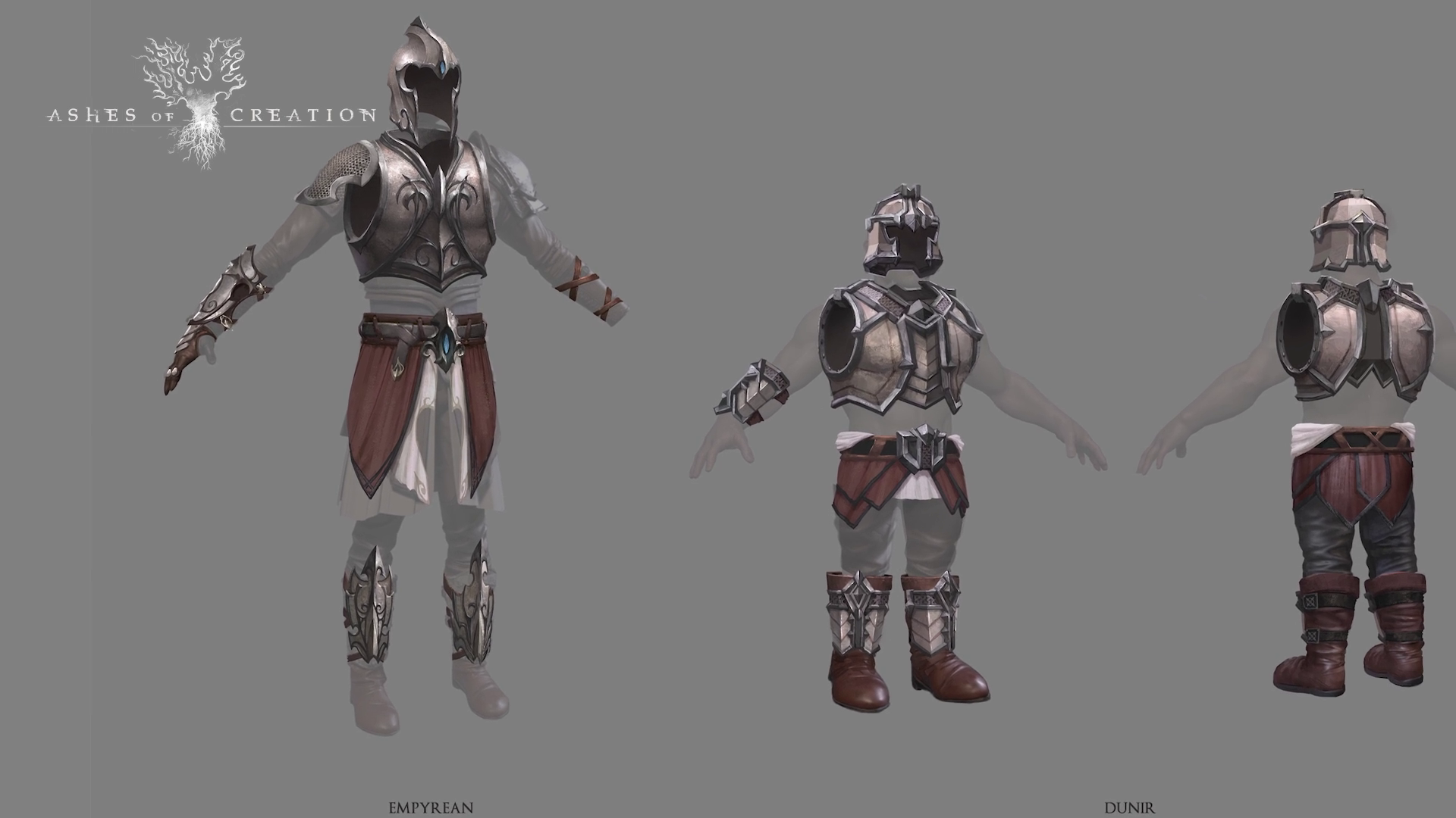
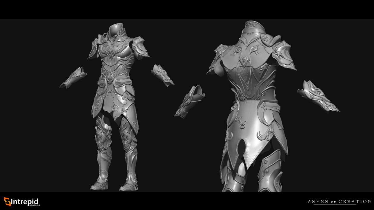
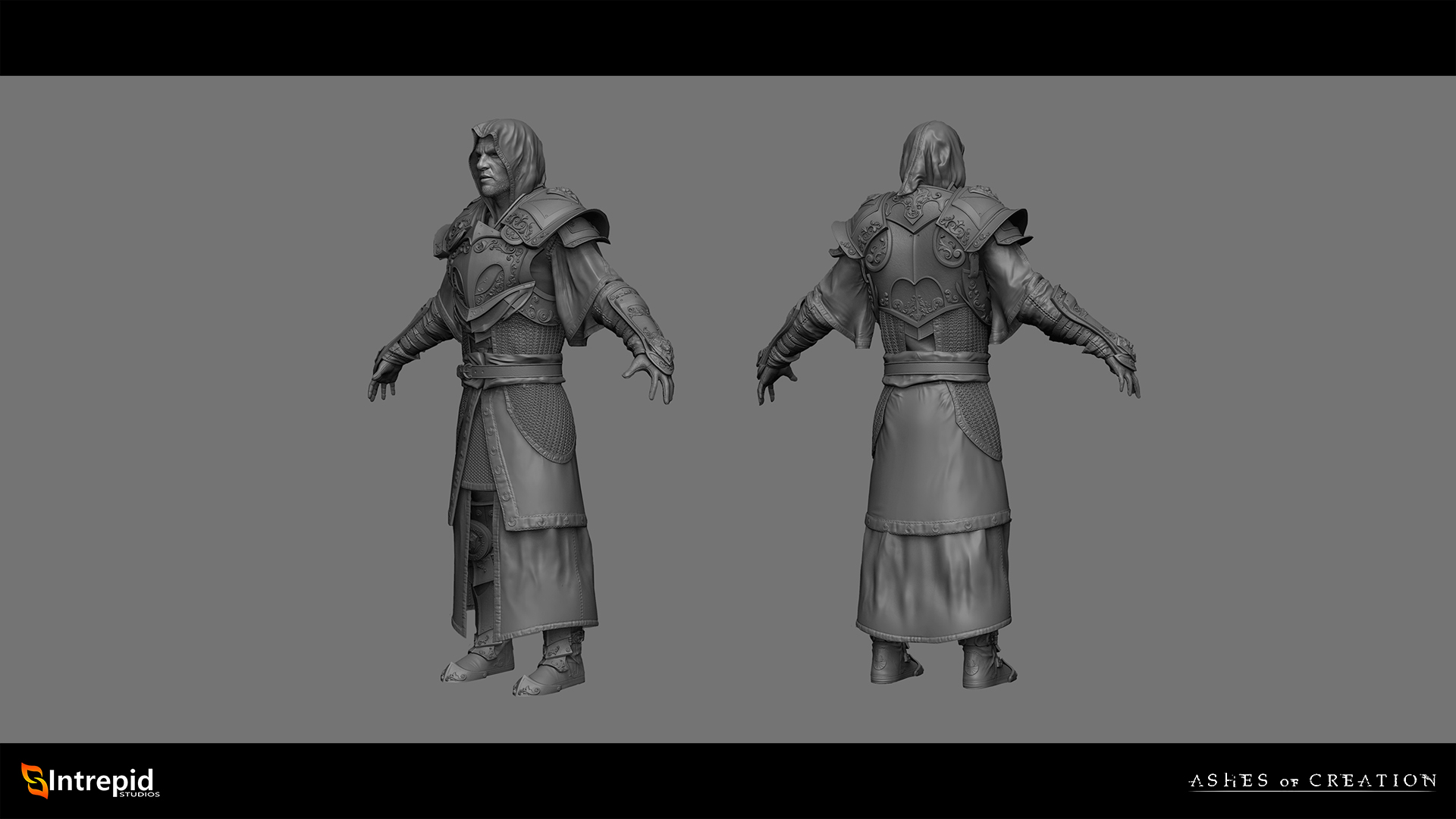
I've been following AOC for several months now and have watched most of the videos showing off game play, weapons and armors. I know all of the footage and images are still in pre-alpha, but that is why I want to address this now. I'm going to post some official art from the Ashes of Creation Dev team and compare them to other art and games.
The Pros
I think overall, the armor is extremely good looking, elegant and well detailed.
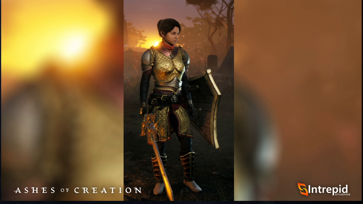
Female Plate isn't useless or skimpy, and actually protects the vital organs.
The armors are impressively diversified racially and match the aesthetics of each race fairly well.
Concerns
My number one BIGGEST concern is that the armor looks flat. I don't mean this in the sense of low polygon counts or lack of detail. I mean that it doesn't have the FEEL of bulky heavy armor. If you look at the gameplay livestreams where Steven is playing the tank, he looks almost indistinguishable from a mage or a healer in outline. The shoulders are small, the breastplate wraps tightly around him like leather armor and doesn't have any apparent weight. Now i'm not a huge stickler for graphics, but I think this might be a big problem for the sake of immersion and class diversity in the long run.
The Lions Regalia Armor however looks amazing it looks bulky, protective and distinguishes itself from the armors above.
Also this concept piece looks very strong and bulky.
Conclusion Overall I think there isn't enough "Fantasy Bulkiness" in the heavier armors please let me know what you guys think, and let me know if you have any counterpoints!
ᚺᛖᚨᚱᚦ ᛟᚠᚦᛖ ᛊᚺᚨᛞᛟᚹ ᛁᛗᛁᚱ
7
Comments
It is good to keep an eye on this during development to see if it's simply that they haven't come around to the heavy sets, or if it really is going to end up like that.
What I think is that they haven't showed us the heavy sets, because we have seen art of stuff that does look heavy like these:
https://ashesofcreation.wiki/Face_of_Sorrow
https://ashesofcreation.wiki/Protector's_Armor
https://ashesofcreation.wiki/Titanbark_Mail
Most non-in game concepts are for the cosmetic items which do not follow the progression paths normal armour will which is why they look more appropriate than what has been shown so far in game
Historically I think armors bulk came from layers. You could have cloth,leather, and chain mail under plate from what I understand. The plate itself would get a lot of its strength from the shape. If you look at AoC concept art. It looks like that they are going for.
Another thing to consider is that in being conservative with armor bulkiness they can minimize a lot of the clipping issues that other games run into. Having ultra thick and spiky parts just makes it ugly when you mix and match parts from sets.
If I had more time, I would write a shorter post.
Armour should have some bulk to it as it is those layers of cloth chain and plate that give it its bulk and thus its protection.
I’m hoping that it’s a bigger difference in the endgame armor sets, but right now we only have hand drawn images of that kind of armor, so I would like to see how it looks in game, also next to different armor classes so we can better see the difference the armor makes.
Those bottom two armor sets look amazing. The first one is okay too but I think its just not my preference.
@Vhaeyne I agree, WoW overdoes it but at the same time things don’t have to look historically accurate, they have to look good and distinguish them from other set types.
@Merek actually found it on an old forum post and it isnt actually ashes of creation official art, I just realized this now while looking for it again. Credit to @ArchivedUser for posting it here: https://forums.ashesofcreation.com/discussion/33857/armor-styles-designs-exc/p1
ᚺᛖᚨᚱᚦ ᛟᚠᚦᛖ ᛊᚺᚨᛞᛟᚹ ᛁᛗᛁᚱ
You will see full plate mage that are almost as efficient as a clothes one.
But for the designs, we should see more massive armor when they show late game content.
What my favourite one is? The Obsidian Armor from APOC that I got in the last day of testing in the first run of it before they made the Network update.
That is true but I still want a battle mage wearing plate to look fantasy bulky and protective.
ᚺᛖᚨᚱᚦ ᛟᚠᚦᛖ ᛊᚺᚨᛞᛟᚹ ᛁᛗᛁᚱ
I don't disagree, keeping on topic of plate armors, take a look at this.
That armor was made some 13 years ago and even though the polygon count is low, the bulk is there. The shape itself is gorgeous.
ᚺᛖᚨᚱᚦ ᛟᚠᚦᛖ ᛊᚺᚨᛞᛟᚹ ᛁᛗᛁᚱ
Those are ridiculous.
So while the Devs are busily trying to interject some realism into the art assets (some garish weapons not withstanding), you are telling me you want WoW style armor (i.e. pauldrons that are literally BIGGER than the breastplate, not to mention how small his head now looks)?
You do realize the armor in the OPs post is closer to what full armor would look actually look like in real life, right? I would recommend doing some research before answering.
I personally LIKE the direction they are headed so we don't have goofy, over the top WoW style armor sets. What WoW has works for WoW but I would hope AoC tries to stay closer to the realistic side.
Also I seem to recall that there won't be traditional armor restrictions, so a Mage for example could wear heavy armor, but at some penalty to their magic ability. So with all classes having a mishmash of styles, not to mention 64 different class combos it might not be so easy to distinguish a caster type at a glance anyway.
I’m saying artistically, the bulk is there. I’m not classifying it as the end all and be all of heavy armor and im not saying that its realistic. I know what full armor actually looks like, I’ve literally written papers about medieval warfare on infantrymen and knights armor, thats not the point. Just because something is closer to what it would actually look like in in real life doesn’t make it better in a VIDEO GAME. Also if you look at my first post I specifically show 3 or 4 armors that are much less dramatic than the WoW armor and still look great. This is high fantasy we don’t need obnoxious shoulders but we also don’t need realistic renditions of unsatisfying chainmail hauberks and gambesons.
Tldr: Studded Leather is cooler than a brigandine.
ᚺᛖᚨᚱᚦ ᛟᚠᚦᛖ ᛊᚺᚨᛞᛟᚹ ᛁᛗᛁᚱ
While, yes, this is just a video game, I would hope IS sticks to a certain level of realism. I can understand wanting a more 'fantasy' look (I said nothing about the completely UNrealistic face of sorrow armor in Tres post. All those points, while looking cool are definitely not practical) but please lets not get WoW crazy. There was a Dev topic about immersion and I should have listed things like that WoW armor as immersion breaking for me. That and carrying around FF sized weapons
Just remember, one of the reasons you wanted this bulkier look was to more easily see the tanks as opposed to casters. Well with 8 classes and x8 variations, that will cause so much mixing PLUS everyone being able to wear anything, I don't think you will be able to easily tell who is playing what based on what they are wearing.
Mage in cloth with tank cosmetic skin on
I heard a bird ♫
The 3d effects of the armour, the "bulkiness" gets added later in the design phase so I wouldn't worry. I remember seeing armour in WoW as an early draft and thinking it looked that way and then when they released it it was too far the other way lol
That said, I don't mind having bulky fantasy armor options as well as the more realistic options. I'm a long-time Warhammer fan, and I absolutely love the Chaos armors for example. All the spikes and stuff are ridiculously impractical in RL combat scenarios, but they do look badass
Give me something like the armor below, and I would 100% make a character just to wear it.
I totally see where you're coming from though - some of the heavier armours we've seen look quite slim-fitted, rather than bulky
From a """realism""" standpoint (note: I am not advocating for realism in video games. Seeking "realism" is dumb because what is "realistic" may or may not actually bring about good game design) there is literally nothing wrong with what you are referring to as "smooth" platemail. Historically speaking, this sort of armor was not "big and bulky and hard to move in." That is a grotesque misconception brought about by armchair historians who have never had practical experience in the field of metallurgy and the demands of medieval warfare. Platemail was designed in large part to have its weight distributed evenly throughout the body, providing superior protection at nearly no cost to agility or maneuverability.
https://youtu.be/kK2S6WoPonY
In this sense, I see nothing wrong with "streamlined" armor.
Now, in the sense of building a visual distinction between classes and helping players to quickly identify archetypes at a glance, there may be an issue here. If the developers intend to allow for visual distinctiveness so that players can readily identify players by their equipment, this style of """realistic""" armor runs contrary to the design goal. If they aren't shooting for that, and are instead aiming for a soft "fog of war" that makes it potentially difficult to determine who is capable of what at a glance, this is exactly what they want; armor that does not have a silhouette that is readily different from leather, cloth, or other sorts of armor associated with casters.
According to the wiki, there is likely to be a "threat assessment" feature on someone's nameplate that will tell you what they're predominantly wearing (cloth, leather, plate, etc), and a number of other features regarding their equipment. Personally, I hope they don't bother with this feature because I prefer games with more fog of war, more interference with your ability to assess who is what, such as Dark Age of Camelot, where you could not readily assess class at a glance. It rewards careful observation and, given what they propose, I think will reduce visual clutter.
As for me, I don't mind if it's a bit flashy as long as it doesn't spoil the world view of Ashes.
However, I don't like it if it looks too cartoony.
This is a discussion of character design, but I want a design like Dark Souls, and I'm not that fond of the slightly rounded design like Fable.
However, it might not bother me that much if there are a few of them mixed in with the many armors.
I'm sorry for my half-hearted opinion. lol