Glorious Alpha Two Testers!

Phase I of Alpha Two testing will occur on weekends. Each weekend is scheduled to start on Fridays at 10 AM PT and end on Sundays at 10 PM PT. Find out more here.

Check out Alpha Two Announcements here to see the latest Alpha Two news and update notes.

Our quickest Alpha Two updates are in Discord. Testers with Alpha Two access can chat in Alpha Two channels by connecting your Discord and Intrepid accounts here.

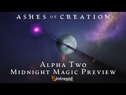
[Feedback Request] Alpha Two Midnight Magic Preview Shown in April Livestream

1235»

Comments

  • CrizzLeeCrizzLee Member, Alpha Two, Early Alpha Two
    Given how large the moon is and how it would reflect light, I think the nighttime lighting looks pretty much perfect. I think it's important to note that not everyone uses the same monitor, nor do they use the same brightness settings, so opinions will vary.

    I really like the contrasting colors of the wand spells in comparison to the darker environment. It really makes the effects pop.

    In contradiction to some of the comments I saw on the video, I do feel that adding spell effect reflections onto the environment might bring too much clutter, especially with large groups of players, and will possibly hinder performance too much for it to be worth it.

    I noticed when Steven looked at the water and a torch reflected off it, it was way too bright and almost looked like the sun. Not sure if this was a bug or not. Other light source reflections looked perfect on the water.

    The water effect around the Sun Spear Streamweaver Steven was fighting could use a bit of work to not look so low poly, in my opinion.

    I'm loving the sound effects of the environment. It reminds me of when I lived near the lake and had a small pond in the backyard. Super immersive!

    Overall, a great job from the team!
  • CrizzLeeCrizzLee Member, Alpha Two, Early Alpha Two
    edited May 5
    I forgot to mention in my other comment - It would be nice to see a fuller animation when getting on a mount, instead of having the camera cut to the riding FOV and then seeing our character saddle up. I think it should be one full motion with the character getting on and the camera panning over to the riding FOV simultaneously. <3

    edit - just realized you can edit your comment (LOL)
  • VenacierVenacier Member
    I really love the darker setting at night, I always hated wander around a world in the supposed night time, and see just as good as day..like, what's the point? Just have three suns and never have night then :/

    The Skybox is absolutely amazing!! I love that it moves and not the same stars all the time. Will be nice to learn more about how the star constellations could affect our gameplay.

    I really like the beams in the Mage wand, I will be playing as a Beastlord, and really look forward to seeing some of the Summoner and it's subs - Beastlord, Necro etc, not just what a Summoner can do, but how the subs will differ. I plan to be a master at Husbandry, and twink the outcomes and hopefully I can use one of these twinked creatures as my Beastlord pet :)

    I am very excited for this game, and am not playing anything else until it shows up...I will be looking for any opportunity to get into A2

    Great Job!!
  • VenacierVenacier Member
    Voeltz wrote: »

    Nighttime

    -brightness levels are looking better than before, but I would like it a bit darker so that vision is impaired at the end of line of sight away from your character or on the horizon. Like others have said it feels like dusk and not a true nighttime. Would be great if there can be different brightness levels based on the moon cycles and have darker locations like forests, caves, and dungeons that may require an illumination spell or torch. Would also be nice if clouds covering the moon/sun cast shadows below and make it darker. Also make the night sky darker to help those colors pop. Hopefully there will be some variation in color so it's not always a blend of purple/pink, I feel that this could be a bit much. Just a dark sky with scattered stars would be nice too.

    -The new moons look great and the sky looks great. Would like to see less clouds in the desert biome and more often clear skies to match the climate while places like the mountains/forests are cloudy more often than not.

    Voeltz is spot on in many comments here...darker in some areas that make sense...forests, caves, cloud cover, no moons out etc, I don't mind carrying a torch or using light spells, definitely less clouds in a desert biome unless it is about to be a rare weather event, and more clouds in a mountain or coastline area.
    Shadows of clouds causing darkness to change would be sweet, and yes, as much as I do like this darkness, even darker, or at least a limiting of vision range in the night should be a thing...I can't see as far at night as I can at day...so my char shouldn't either.

    Speaking of clouds on the coast...Fog should be a thing in the mornings in some areas :) Just like a San Diego Marine layer that sweeps in over I5 causes all the fun traffic crashes!!!
  • DiamahtDiamaht Member, Braver of Worlds, Alpha One, Alpha Two, Early Alpha Two
    Wand Combat - Looked great! The fast, almost Rapier/Dagger like motions were perfect. It should keep a very fast stabbing and slashing theme. Don't get too "twirly" with the animations or it will be less appealing.

    Nightime Lighting - I like the change. I wouldn't go too much further. The dark feeling is great but I don't want to lose too much visibility in an MMO
  • AtomikuAtomiku Member, Alpha Two
    edited May 5
    It looks perfectly fine, I'm loving the purple-ish sky and the balance of darkness and brightness. However, adding some additional details to the skybox like varying-sized stars and larger nebulas or clouds would really make it better. Think along the lines of MH: World for reference (I'm being nitpicky, though, as it already looks good).

    caefeea13kb0.png


    Some people say the night time should be even darker, but in my opinion making it darker would make it annoying and harder to visualize your surrondings. Inmersion is important, but now it's in the sweet spot where we have good inmersion as well as enough brightness to play comfortably.

    As for the vfx on the fireball explosions I think they need to be a little more polished, it looks kinda "flat" and "dry" if that makes sense, but everything else is pretty neat, including the lightning ball visual rework.

    9unznhvouxf8.png

    The detail on the wand changing colors depending on the element is amazing btw.

    Can't say much more by now considering this is still an Alpha. So far so good, you're in the right direction Intrepid!
  • XeegXeeg Member, Alpha Two
    Another cool thing I liked about the wand was adding elemental effects. Giving every character a way to get an elemental effect if they really need to for some reason.
  • YueOriginYueOrigin Member
    Right now. None of the classes or weapon shown ever came close to interest me.

    I'll be much more interested when Spear/Lance/Halberd/Polearms/Tomes/Orbs are shown.

    Class wise fighter was my first intent but seing it use a generic greatsword killed my interesting for the stream so I didn't remember much.

    This time as well. Wand aren't really up to my taste. Maybe if it was staff I would have given some interest but not for wands sadly.

    I'll be expecting some interesting streams in the future regardless since I've seen hat the Rangers where satisfied with their own showcase so maybe I'll find one that will give me a interest in any class.

    Because right now all I care I wielding a Halberd or Spear.

    No classes really catch my interest honestly.
  • This content has been removed.
  • Ace1234Ace1234 Member
    edited May 21
    Per my usual feedback, I think its interesting when there are both distance management considerations that need to be made, as well as choices to be made at varying ranges regarding offense, defense, movement, and sustain, of which feed into the overall combat flow. Ive made a thread on this in the past regarding these different types of effects.


    Things like wand attacks that enable you to control and manage distance/range and to set up for other abilities at either that range, or abilities at others ranges (through effects like push/pull/side-knocks/stun/slow/haste for example), or attacks in the weapon combo that directly provide benefits relating to

    1. Offense (direct damaging wand attack)

    2. mobility (wand attack that moves the user or the enemy)

    3. defense (wand attack that protects the user in some way, like spawning a barrier/shield/obstacle/or just absorbing/trampling over the enemy attacks)

    4. sustain (wand attack that provides sustain to mana/health, such as a life leech beam, a mana sap, or a regen effect)

    5. Or overlapping combinations of the above effects, such as offensive attacks with mobility effects for example.

    6. or indirectly providing each type of those benefits through proccs such as the following examples:

    A) proccs that can affect mobility (like stuns/slows on enemy, or speed buffs to the user for example)

    B- proccs that can set up for damage (like damage over time effects that free you up to be able transition to other attacks, or other bespoke proccs that can make future attacks more effective)

    C) proccs that can provide defensive benefits/setups (like stuns that prevent enemy from attacking, or buffs to user that can provide protection, or proccs that can generate protective assets such as obstacles)

    D) Proccs that can provide sustain, such as a life leech over time


    I know some stuff from this video isn't completely transferable to an mmo due to the VR nature of the game, but look how interesting ranged combat can be when you add some of these types of design aspects, along with some more in-depth physics, if desired.

    https://m.youtube.com/watch?v=FIR_2t9TskQ&amp;t=3s


    Oh, and while animation/effects are being polished, the Smash Bros (which is known for having amazing polish, effects, and game feel) creator has a channel called "Masahiro Sakurai on Creating Games"; which has some interesting content regarding those things as well as optimizing "game feel" and some other game dev stuff that could be useful to you.
  • GrappLrGrappLr Member, Alpha One, Alpha Two, Early Alpha Two
    Very easy feedback from my end. It is too washed out in locations that don't have a proper light source, ends up being a very monotonous, grey color palette. On the other hand, looks beautiful around fires/lights. An easy fix (possibly) might be making the moon a true light source. Either way, here's an illustration showing what I'm talking about.

    image.png?ex=663e5b73&is=663d09f3&hm=dc72b3e689442281792fd86a07d8beecdece3b273b435d6b926093c1f817ec44&
    vs
    image.png?ex=663e5b74&is=663d09f4&hm=9cfffd125d4066889bb3b22e20fc81d7bd4a27f290ac227115092e84fb3045b3&
  • XeegXeeg Member, Alpha Two
    Another point. Almost everyone who wanted it darker also wanted more light sources, torches, etc.

    It's not that they want to play a game in black screen, they just want lighting to be a part of the game play. If the devs aren't planning on that, then keep the game bright enough to be visible please. Considering the day/night cycle is a constant element of the game that everyone will experience on a regular basis, not many really want it to just be a pitch black monster shock horror agro mess.
  • KatrellKatrell Member, Alpha Two
    edited May 11
    First and foremost, I liked what I saw. I believe you guys are headed in the right direction. I'd just like to add some suggestions to consider.

    Night/Day Cycle
    Steven mentioned something like 15 min. In my opinion this is much too short. I'd like to see the cycles have a greater impact on planning of activities. Be those personal or group/guild. For instance, 15 min cycles makes it to where you can pretty much do anything anytime, but if you go to an hour or 45 min then the players have to optimize how they will do certain things. If you have certain gatherables that can only be found at night, then you'll want to plan that 45min window ahead of time. If your caravan team is extra powerful in the daylight, for whatever various reasons, then you'll want to plan your launch time for the first light of morning. Shorter intervals just makes the system less impactful.

    Darkness Level
    I personally would love to see the darkest of night times. I enjoy that feeling you get in the survival genre of truly being in the dark in dangerous places. However, I also understand the MMORPG genre and get why this is a tough thing to do. So, I suggest we look to weather and events to produce this super darkness many would like to see. 1 in 10 nights is cloudy so it's super dark. Super dark during night time thunderstorms. Maybe there's a world event causing the moon to dim or vanish, super dark. I think this is a fun middle ground.

    Night and Day Impacts
    This kind of comes back to the first point. I'm hoping we do get to see Night and Day affect player abilities in Ashes. A big example might be for the Rogue - true stealth at night, some sort of camouflage during the day. Stronger fire spells in the sunlight, etc. It's these sort of ability interactions that could make Night and Day feel so impactful that we coordinate events around this system. It makes nighttime feel dangerous, like in a survival game, if you know the rogues are sneaking about being extra powerful when the sun goes down.

    As for Wands
    I think the various ways of designing how the wand combat works is 6 of one and half dozen the other. What you have so far looks like a great direction. My concern for wands for the mage is it replacing their spells too much. I'm not saying that we've seen that happen yet, I just want to caution from it happening. This is probably more a balancing point, but it's also a design point. I think the wand should be filler and play second fiddle to spell usage. If the wand gets too strong, players won't bother with spells - which would just feel weird.

    Thanks for reading!
    Katrell
    Future A2 Tester

  • ContortzzContortzz Member, Alpha Two
    Having all skill trees visible on the same screen without having to tab back and forth would be great. So I could have my stamina, weapon and character skill trees side by side when making choices.
    The Casual Conspiracy - MMO exploration meets relaxed camaraderie! Embracing discovery and fostering a welcoming atmosphere. From casual enthusiasts to hardcore veterans https://discord.gg/VXsUd4DND4
  • The stars look amazing, and the lighting effects are looking great. I'm really excited to spend time in such an aesthetically pleasing world! I'm really interested in how the constellation system is going to work!

    I am happy with ashes re-imagining iconic abilities within the RPG genre, but calling three successive fire attacks 'fireball' does not make sense. It would have to be 'fireballs', and that just doesn't quite have the same ring to it. It feels more like the DnD ability scorching ray. When I think of fireball, it's just a big ball of fire.

    One request I have is to add detailed time stamps to the youtube video. It will help save a lot of time looking back over the video when the time stamps divide up the various parts of the showcase. I forget when certain stuff gets mentioned, so when I look back over I have to spend time scanning through the footage. I think it would be really helpful in making feedback easier!
  • edited May 14
    Night sky and lighting effects look amazing; great work. It definitely feels like an environment you want to see more of. I noticed that the clouds were moving quickly. It might be worth adjusting the speed of those animations; it felt like time distorting and I couldn't tell if it was intended to simulate a faster timeline in-game compared to reality but everything else seems to move at a more realistic rate.

    The wand abilities are, likewise, awesome. Really cool that the graphics have variable track routes and that there is a uniqueness to each cast of sequential repeat abilities. The one thing that seemed to be missing was some factor that indicated spell completion aside the animation of the spell effect on the target. It seems like there should be something climactic on the caster's side of things where there is a spark or something signifying that the caster had manifested the full power of their essence to unleash into the spell and then released it with some kind of powerful visual.

    I was thinking something like a manifestation of essence in the off-hand as if the caster were using their free hand to shape and wield the raw essence and then harness it into the wand and have some kind of synergized visual surging the energy/essence into the spell outward from the caster for each spell. I feel like that would make the mage character feel very alive and powerful.

    I wasn't pushing the buttons but I'd like to feel like I'm throwing and wielding magically harnessed elemental forces out of raw essence. Thinking of Dragonball Z, there is something cool about the dramatic build up and release of the kamehameha and how it has a gravity to it.

    Hopefully that comes across as intended. The spell effects look awesome. Great detail, can't wait to play the mage and roam around at night. I'm a very verbal visualizer so it helps for me to characterize different effects visually and, to me, it would be cool for the mage to have a bit of an encanter effect where the playstyle has a feeling of continuous fluidity. I think adding a climactic spell release effect will make it more seamless and real as if you were throwing the weight of a fireball or bearing down through the discharge of generated static electricity toward the hopeless assailant. The chain lightning ability was a perfect example of this. That ability felt perfect in the video. You can really sense the gathering of energy and it's potency. Definitely impressive for this stage of development. This is going to be unmatched at full deployment! As a lifelong MMO player in my 30s (beginning from the age of 5) I can really appreciate what you guys are doing here! Good work AOC team!

    P.S. Please refrain from overcomplicating the weapon specialization and customization features. It seems like games with these features can sometimes quickly turn it into a burdensome maze of mix matching the perfect talent/spec of abilities and the end result is that you really end up with one meta that everybody uses and it's just overcomplicating something unnecessarily. WoW does this with item enhancements and it just becomes unfun when you're making gear choices and doing the maintenance of managing abilities. More abilities and talents is not always better.

    Unrelated but an idea I want to try to plant as a seed: if mobs are somewhat organized into encampments please consider having full-area roamers. I've been in actual military deployment encampments and have seen what it looks like to observe these types of systems and rarely do subjects stand in one spot where they "spawn & stay." Give them a social roaming path so that there is risk if you don't pay attention to which direction all the mobs are headed. Require players to maintain a vigilant awareness if they're venturing into a mob encampment. It should be possible to get jumped by the whole group of them if you time things wrong.
  • DaggialDaggial Member, Alpha Two
    edited May 21
    SunScript wrote: »

    I personally found the lightning spell Steven uses at 1:26:07 stream time (not Ball Lightning, I can't remember what it's called) to be too bright at night, I would definitely prefer that toned down: m72l7Oq.png

    I agree and on top of this, spells effects in the middle of the screen are pretty bad for visual clutter.
    You could see Steven having turn the camera around every time he casted this spell because he can't see what's in front of him.

    O5RUPQ0.png
    wg0mhcewv6e9.png
    Monkey Business (EU) is RECRUITING
  • netrimosnetrimos Member, Braver of Worlds, Kickstarter, Alpha One, Alpha Two, Early Alpha Two
    I like the concept of the skybox. When everythings implemented you should show us a timelapse of it at a fixed camera angle. As far as how dark night should be, I'd just like the ability to set a black point so that blacks don't look washed out on OLED
  • SolvrynSolvryn Member, Alpha One, Alpha Two, Early Alpha Two
    The weapons do not have their own identity and feel very tied to the classes, rather than a compliment to a playstyle.

  • The_Gaming_ButlerThe_Gaming_Butler Member, Alpha One, Alpha Two, Early Alpha Two
    I love the attention given to weapons via the skill tree - it makes weaving in wand use as part of the combat exciting, rather than something to do when I'm out of mana, or to pull a back. Wands are largely underused in most games, and I really like how there will be more to it in AoC.

    The magic overall is look amazing - you are on the right path.

    The night time, looks really good, but I'll have to reserve final judgement until I see it for myself in Alpha 2.

    I would like to know more about he mage class, specifically about spell families. In most games, there is a benefit, or even a compulsion to go down one tree (example, fire mage, ice mage, lightning mage, etc) So far it seems that a mage has all the spells at their disposal. Will be see people focus because there are incentives to? Or will focus be a drawback, that limits the player? Curious to hear much more about this.

    Keep up the great work!

    Cheers,
    -=TGB
    Ashes of Creation News can be found on The Gaming Butler News Channel
    https://www.youtube.com/channel/UCP31ixSBO7GHKLBefWVcJaA
Sign In or Register to comment.