Glorious Alpha Two Testers!

Phase I of Alpha Two testing will occur on weekends. Each weekend is scheduled to start on Fridays at 10 AM PT and end on Sundays at 10 PM PT. Find out more here.

Check out Alpha Two Announcements here to see the latest Alpha Two news and update notes.

Our quickest Alpha Two updates are in Discord. Testers with Alpha Two access can chat in Alpha Two channels by connecting your Discord and Intrepid accounts here.

[Player Feedback Request] Updated Ren’Kai Concept Art Shown During July Livestream

VaknarVaknar Member, Staff
edited August 2022 in General Discussion
Hello glorious community,

We’d like your feedback regarding the look and feel of the updated Ren’Kai male & female concept art. We shared our most recent art of this race during the July Development Update livestream.

Your feedback matters to us! As a direct result of your previous feedback and our creative direction, you can see that major changes have been made in comparison to the last time you saw the Ren’Kai.

Updated Ren’Kai Concept Art
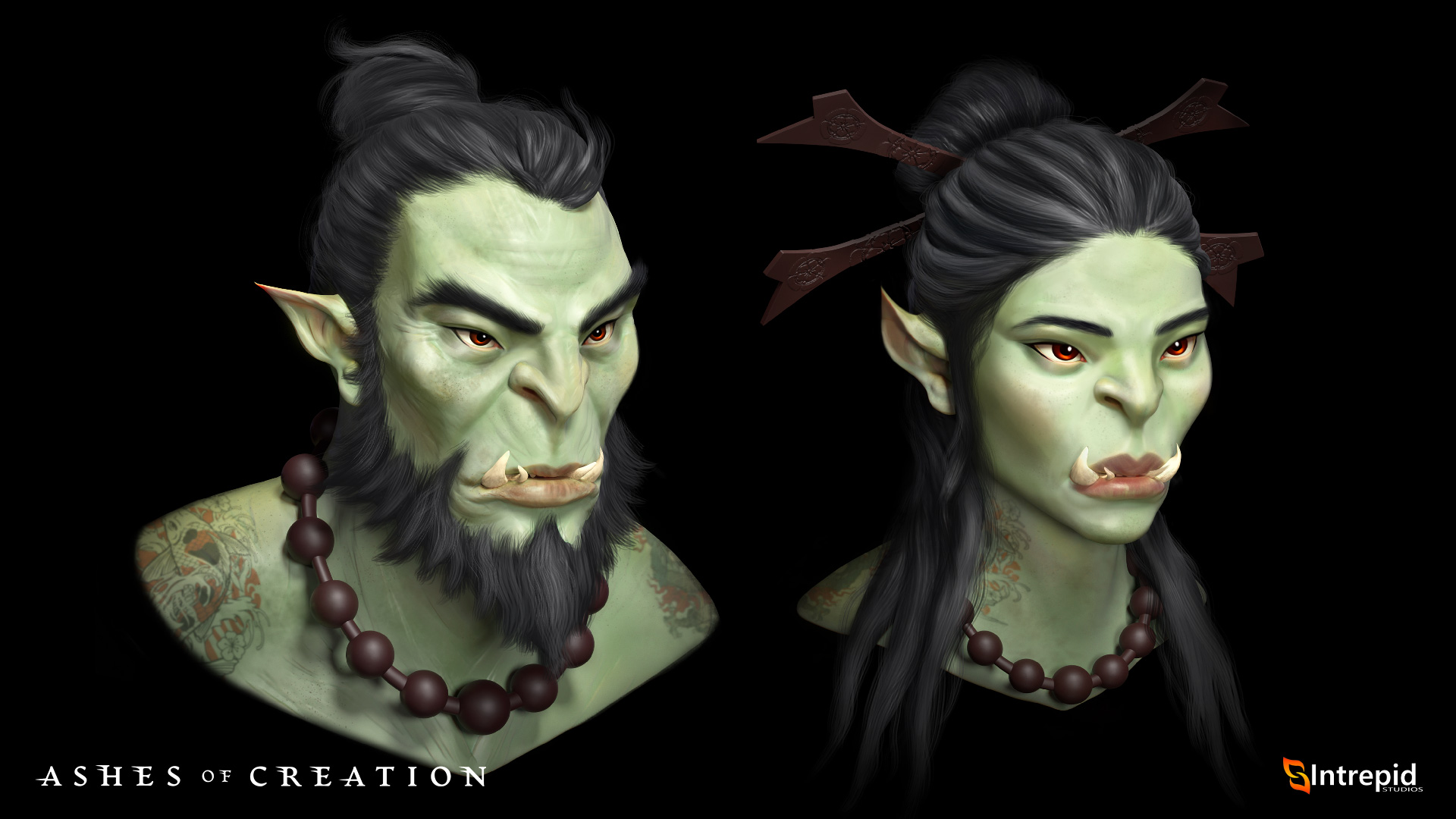
REN_Face_Concepts.jpg


To help guide the conversation, here are a few thought starters:
  • What do you like about the current art direction of this race?
  • Is there anything you dislike about the art direction for this race, and why?
  • What are your thoughts on what was shown during the livestream for the Ren’Kai female & male concept?
Don’t feel limited to the questions above. Please, share anything you’d like about the Ren’Kai race design.

We’ll be leaving this thread open for your feedback until the end of the day on Friday, August 12, 2022, so that we can begin compiling a report for our development team.

Everyone here at Intrepid Studios looks forward to reading all the great reactions to our latest character designs!
community_management.gif
«1345

Comments

  • LudulluLudullu Member, Alpha Two
    Very animaish. Like the direction overall.
  • TheDarkSorcererTheDarkSorcerer Member, Alpha Two
    Much better direction! I feel like the race have an identity now!
    m6jque7ofxxf.gif
  • DmhofmaDmhofma Member, Alpha One, Alpha Two, Early Alpha Two
    I don't mind the new art, but I personally prefer the older art for ren'kai orcs. If I play an orc I want to be a big beefy green man with gigachad facial features. I hope that the customization allows for that while also allowing customization like this.
  • SnowElfSnowElf Member, Alpha Two
    I'm gettin Uncle Iroh and Azula vibes, yas kween.
  • FalleniFalleni Member, Alpha Two
    edited July 2022
    Love the direction I'm not generally fan of orcs but these ones look amazing.
    I like the Asian influence and more cartoonish style.
    They distinguish themselves from orcs in another games which is great.

    For customization I'd like to let people build really beefy orc as well and skin color customization so you aren't stuck with generic green orc.
    4hs72d0ersoh.gif
  • LeukaelLeukael Member, Alpha One, Alpha Two, Early Alpha Two
    edited July 2022
    I like the direction but I will said I would like the facial structure to vary more against the Empyrean (cheekbones specifically.) I would like them to have a little more musculature/meat on them generally in their choices relative to the elves.

    Facial Musculature Opportunities (more pronounced):
    * Under the eyes that run from front of cheek to bridge of nose
    * Sides of face (the muscles that run from temple down to jaw)
    * Under jaw that run down from below "canine teeth"
    * Sides of forehead

    Other Opportunities:
    * I feel like the ears could be differentiated from the elves more so... again shorter and somehow different (rounded or slight over hang on top.)

    These would add some silhouette identity and support a slightly more feral look and one that also physically supports those Ren'kai chompers!

    What I liked: I liked the nose (could be a bit less recessed) the tattoos, colors used, and those hair pieces look awesome.
    Stag-Axiom-Sig-LEAUK3.png
  • SirChancelotSirChancelot Member, Alpha Two, Early Alpha Two
    I absolutely love it
    I really hope their character creator keeps tattoo options of that irezumi style of tattoos
  • GreatPhilisopherGreatPhilisopher Member, Alpha Two
    looks great , i just hope they keep the scales and big brutish look possibilities in customization . Asian orcs tho lol
    ykwk7qwgw5os.jpg
  • VoeltzVoeltz Member
    Exactly what comes to mind when I think of an Orc! Make sure to allow a variety of customization including body types and skin colors. I think it would be awesome if you could go with a dark green, black, brown or tan like the previous rendition.
  • NerrorNerror Member, Alpha One, Alpha Two, Early Alpha Two
    Asian orc looks really nice! I hope players can go a little more brutish though, like the old version. Conceptually it much better matches the Vek and the other updated races.
  • Keeper262Keeper262 Member, Alpha Two
    Loving the Ren’Kai Orcs a lot. Including some warpaint tattoo options might be cool. If that fits with their story lines.
    mb0cim94ewc4.png
  • CorpierCorpier Member, Alpha Two, Early Alpha Two
    edited July 2022
    I think it looks a little too cartoony. I liked the old Ren'kai slightly more. The new model reminds me of WoW orcs. If the Vek are scrawny goblins, it would be cool to have the option to have the opposite side of significantly larger and more muscular models in the Ren'kai. I do like the more prevalent Eastern Asian influence that is represented in the new Ren'kai though.
  • RalizekRalizek Member, Braver of Worlds, Kickstarter, Alpha One, Alpha Two, Early Alpha Two
    I'm not a fan of the new style, It's just too cartoony for me. Its pushes into "WoW" style, for me, it's just too much. I wasn't 100% into the pig snout of the old model but I definitely need to be somewhere in the middle. Find a middle ground between the two. Maybe it's just the Green you used, but what was shown today just wasn't it for me.
  • AlacriteAlacrite Member, Alpha Two
    edited July 2022
    I always played as an Orc since I started DND when I was like 10. Since I'm Asian, this is like, perfect for me. I actually cheered for it when i saw it lmao.

    This brings up a major question to me though. For the Human race, will it consist of features regarding all different types of real people? Meaning, the real races. Since there's also a split between the Humans, the Kaelar and the Vaelune, will the Vaelune be a significantly deviated version of a real-life Human, or is it going to represent just a different existing race?

    I saw the wiki says Vaelune will be of a middle-eastern influence. Kaelar are of a European influence.

    Even though it's not for me personally, I think it would be weird to be forced to play Orcs to play a character that represented my particular race. I think in terms of just physical features, Kaelars should consist of all real life races. The cultural aspect is different and cool to be associated with different in-game races.
  • JustVineJustVine Member, Alpha One, Alpha Two, Early Alpha Two
    They look like the dragonic blood that seemed to originally be present in the previous model completely evaporated. I think that does them a disservice as it was part of what made them feel less like 'humans but green' that some fantasy settings tend to tilt orcs towards.

    I therefore think both the male and female model could use a little more tilt in that art direction. Something in between this and the previous is better in my opinion.

    Other than that I like the hair style and facial complexity of the male. I'm not sure how I feel about the female model as she has a lot more simple facial complexity in a way that is jarring when beside the male. I'd need full body context to tell if this is a problem or not.
    Node coffers: Single Payer Capitalism in action
  • unknown.png?width=790&height=453
    Did a quick mod of the Ren'Kai image

    I believe this helps with the new design. I think the lighter green makes it feel too cartoony perhaps a bit more saturation on the green might help.
  • Morg7x7Morg7x7 Member, Alpha Two
    It's very hard to form an opinion from head shots. Without seeing the full silhouette this reads to me as an agile martial artist not the hulking brute we had before. I assume the customization allows us to take it in either direction?

    I do like the theme, a Ren’Kai samurai archer is definitely on my shortlist.
  • -T0Mb--T0Mb- Member, Alpha Two
    edited July 2022
    I like this new Ren'kai look but in my opinion they look too cartoonish and I liked the old models more. Those hairstyles and jewelleries look very good!
  • KDecisionzKDecisionz Member, Alpha Two
    The picture itself gives off a very Asian feel and maybe they are the Asian culture representatives in the game and that would make sense. Otherwise they look to nice I'd like to see a lot more aggression in there features also does all the races in verra have elf ears? The Male tusk seems to match the female tusk but wouldn't generically there's would be bigger because there males? but you should have the option to make them smaller and what not
  • daveywaveydaveywavey Member, Alpha Two
    Corpier wrote: »
    I think it looks a little too cartoony. I liked the old Ren'kai slightly more. The new model reminds me of WoW orcs. If the Vek are scrawny goblins, it would be cool to have the option to have the opposite side of significantly larger and more muscular models in the Ren'kai. I do like the more prevalent Eastern Asian influence that is represented in the new Ren'kai though.

    Yes! Exactly this. I don't want to play World Of Orc-craft, I'm here to play Ashes Of Creation. The previous Ren'Kai Orc was unique not just to the other Ashes races, but to orc races in general. It was fab. The huge muscled beefcake was exactly what they needed to be. This new version just feels like you're trying to cater to the WoW crowd, and made me think more of Shrek and Fiona than anything else.
    This link may help you: https://ashesofcreation.wiki/


    giphy-downsized-large.gif?cid=b603632fp2svffcmdi83yynpfpexo413mpb1qzxnh3cei0nx&ep=v1_gifs_gifId&rid=giphy-downsized-large.gif&ct=s
  • SolvrynSolvryn Member, Alpha One, Alpha Two, Early Alpha Two
    I like the new facial structure, I think the green littles a little bit of grey wash.
  • daveywaveydaveywavey Member, Alpha Two
    Is anyone good enough at photoshop to put the new hair, ears, and eyebrows onto the previous beefy Ren'Kai model? Just curious what it'd look like.
    This link may help you: https://ashesofcreation.wiki/


    giphy-downsized-large.gif?cid=b603632fp2svffcmdi83yynpfpexo413mpb1qzxnh3cei0nx&ep=v1_gifs_gifId&rid=giphy-downsized-large.gif&ct=s
  • daveywaveydaveywavey Member, Alpha Two
    Other than the bigger ears and the purple-ness, I'm trying to spot the difference between the Vek female and the new Ren'Kai female. And I'm having trouble...
    This link may help you: https://ashesofcreation.wiki/


    giphy-downsized-large.gif?cid=b603632fp2svffcmdi83yynpfpexo413mpb1qzxnh3cei0nx&ep=v1_gifs_gifId&rid=giphy-downsized-large.gif&ct=s
  • LovewellLovewell Member, Alpha Two
    I like it, gave them more of an identity, more of a cultural distinction from the older versions.
  • DeviLzFury_GamingDeviLzFury_Gaming Member, Alpha Two
    I am inbetween here. Never been a Orc player but from before and now after id lean to more features from older shown. Meaty,beefyer, features. These look a bit more "polished" very soft features and lines. id go a bit more less pronounced such as the new elfs.

    Also the green needs to get looked at looks to cartoonish/Boarderlanish vibes.. maybe a deeper green missed in with skin features.
    2edh26ackfsa.png
    The Wolves of Verra
    are recruiting: https://discord.gg/4bFySwxS
  • Zenny9Zenny9 Member
    edited July 2022
    Not a fan of the new models, I liked the old ones more. They don’t look orcish enough to me, they need to be more bulky and have their facial expressions look more aggressive.

    Hair styles, tattoos and skin color are the positives here.
  • I think this headed in the correct direction, but I agree with other sentiments that it went perhaps a bit too far. It is difficult to distinguish a Vek from a Ren'Kai female at this point. And I personally think the more bulky ogreish appearance of the first concept is lost in almost it's entirety. I think the male and females should be bulked up or have a bulkier option reminiscent of the og. I think there might also be a benefit in differentiating from the Vek more with something like ear cropping or something different with the ears.
    On the plus side I love the vibrant colors with the skin, the green looks super good. The tusks are great, the facial structure is on point. I like that direction greatly.
    Good job all around 👏
    dbijjcb82bfn.png
    Professional Skeptic, Entertainer, and Animal Enthusiast
  • PiggyNoseGirlPiggyNoseGirl Member
    edited July 2022
    Personally, I'm absolutely in love with this new direction. The Asian influence is amazing! Really liking this more discreet approach, too. The moment this concept art was unveiled on stream, I got very excited.

    I personally like that the bulkiness was seemingly toned down a bit, but I still hope that this is something that can be touched up in the character creator, so that those who prefer more bulk can also be happy with their Ren'Kai.
  • ZtarkIZtarkI Member
    I think this is way better than the older Ren’ Kai model.

    For me the older model lacked identity, and I feel like this concept art represents the orcs identity a lot better.
  • LinikerLiniker Member, Alpha One, Alpha Two, Early Alpha Two
    edited July 2022
    Loved it! as always, very talented team, however, based on this thread, I just hope Intrepid stops taking feedback and making so much changes and just stick to their own vision and move forward, wasn't expecting intrepid to waste so much time on the first ren'kai just to change it completely because people asked for more "personality" and as you can see, now there's already people saying they liked the old ones more.

    People just don't know what the fuck they want... Intrepid should do what they think it's best and Move Forward with the game. I personally really like this direction, and I hope we don't see any more changes.

    Same for everything else, especially combat, otherwise I fear we might end up with a Frankenstein of a game, trying to make everyone happy but in the end, making no one happy.
    img]
    Recrutamento aberto - Nosso Site: Clique aqui
Sign In or Register to comment.